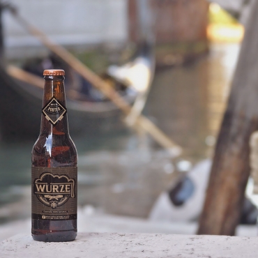
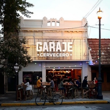
He showed me the brand that they were using, and we talked about the changes they needed.
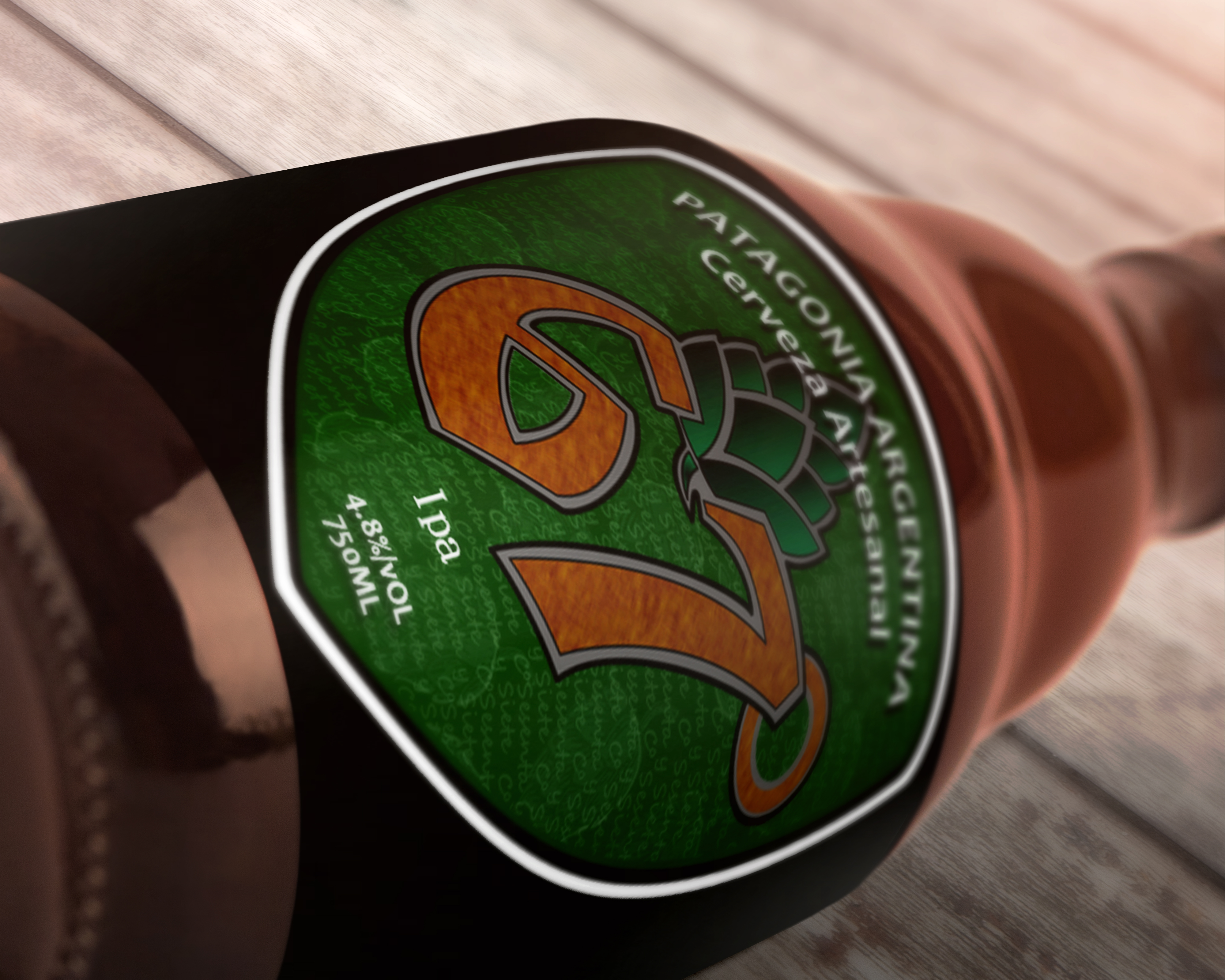
They were looking for a cleaner aesthetic, and we also discussed the possibility to add some graphic elements that made reference to the Patagonia. With that (and some references that they gave to me), I started working on some sketches for the brand.
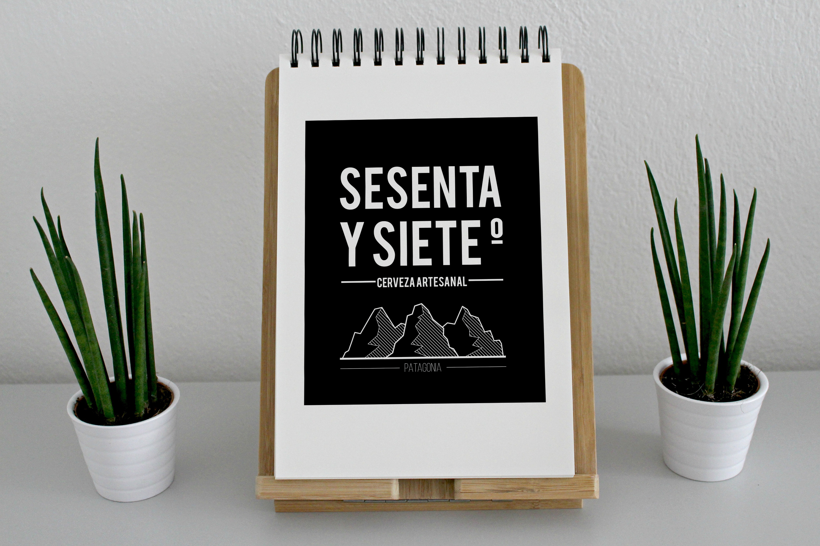
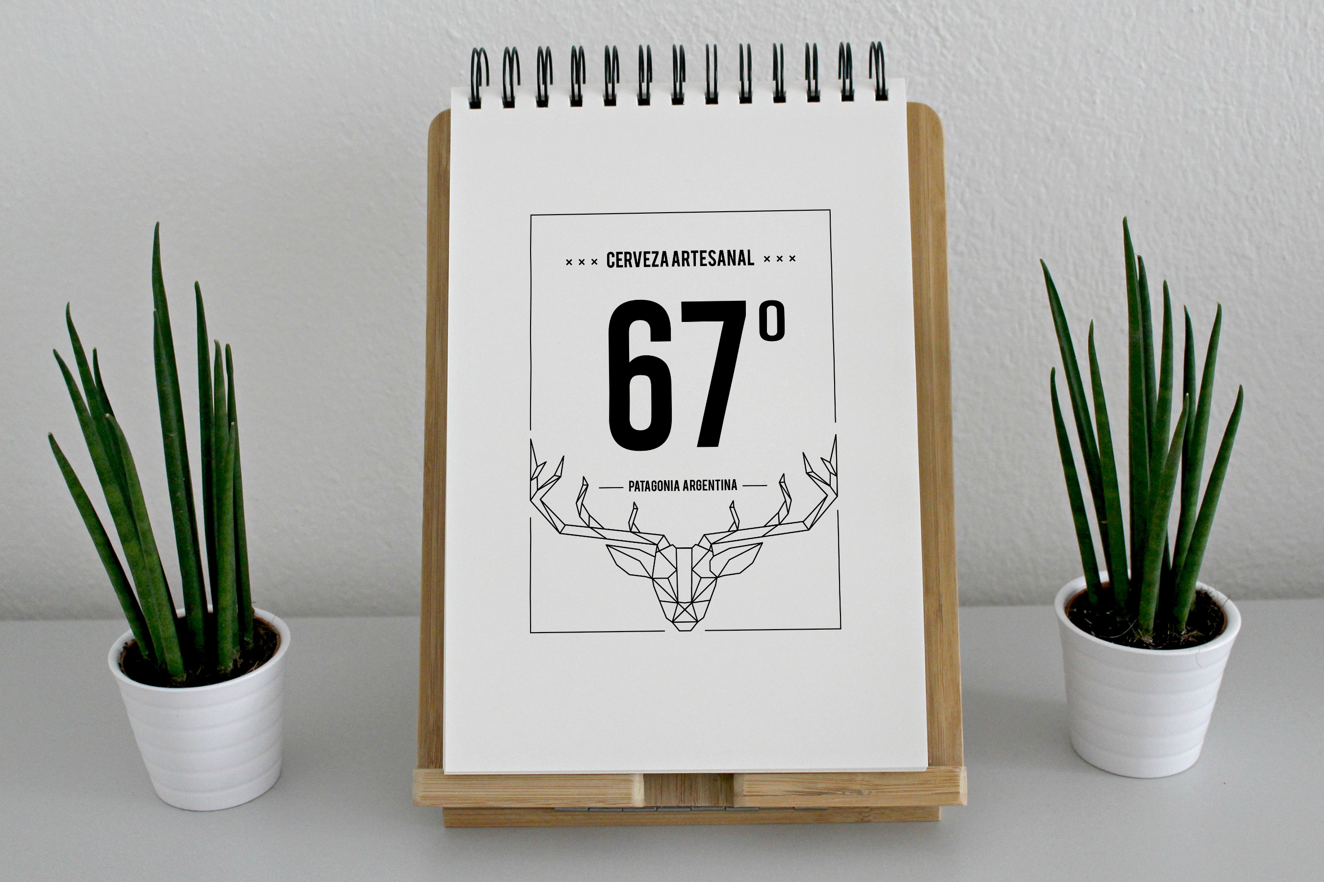
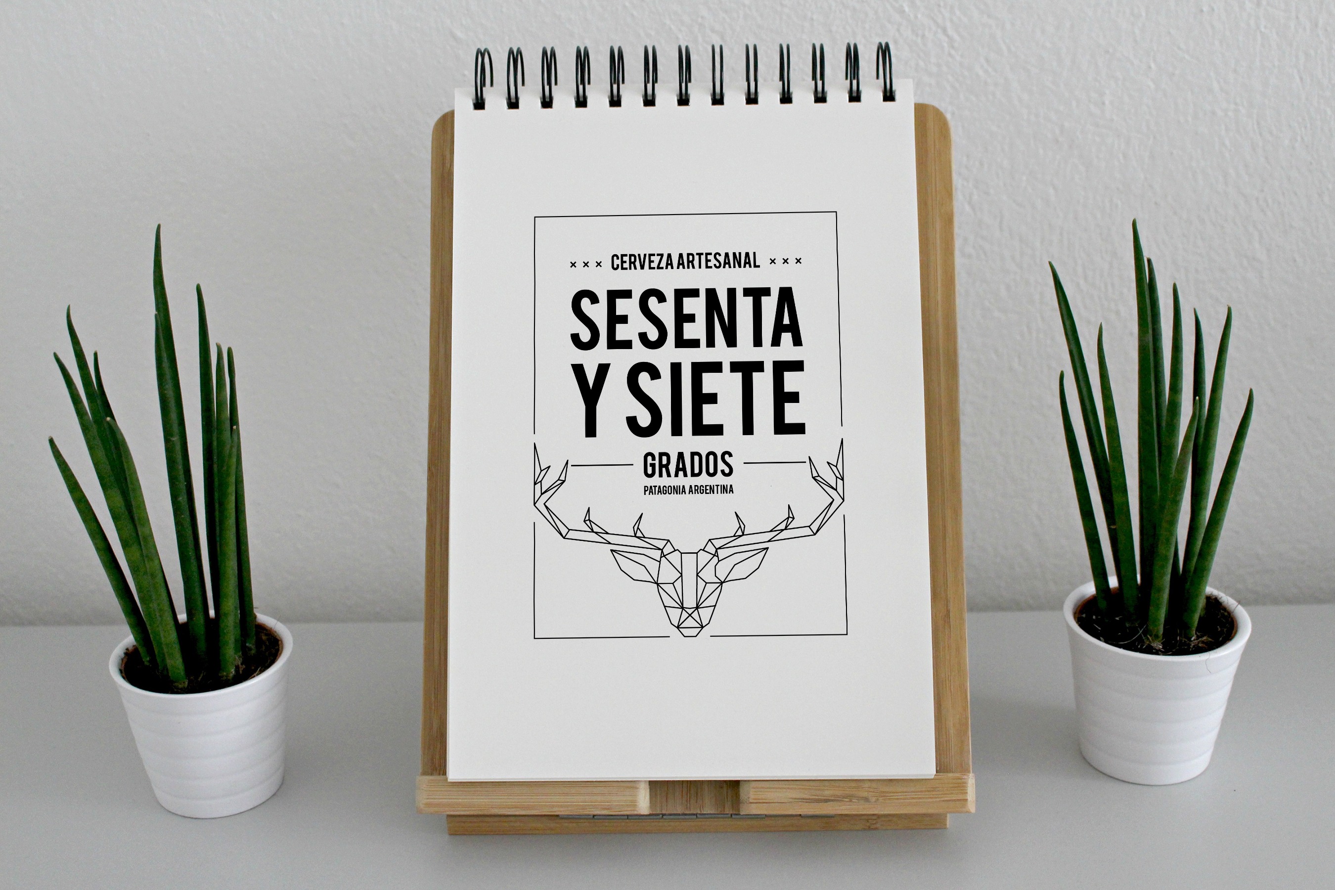
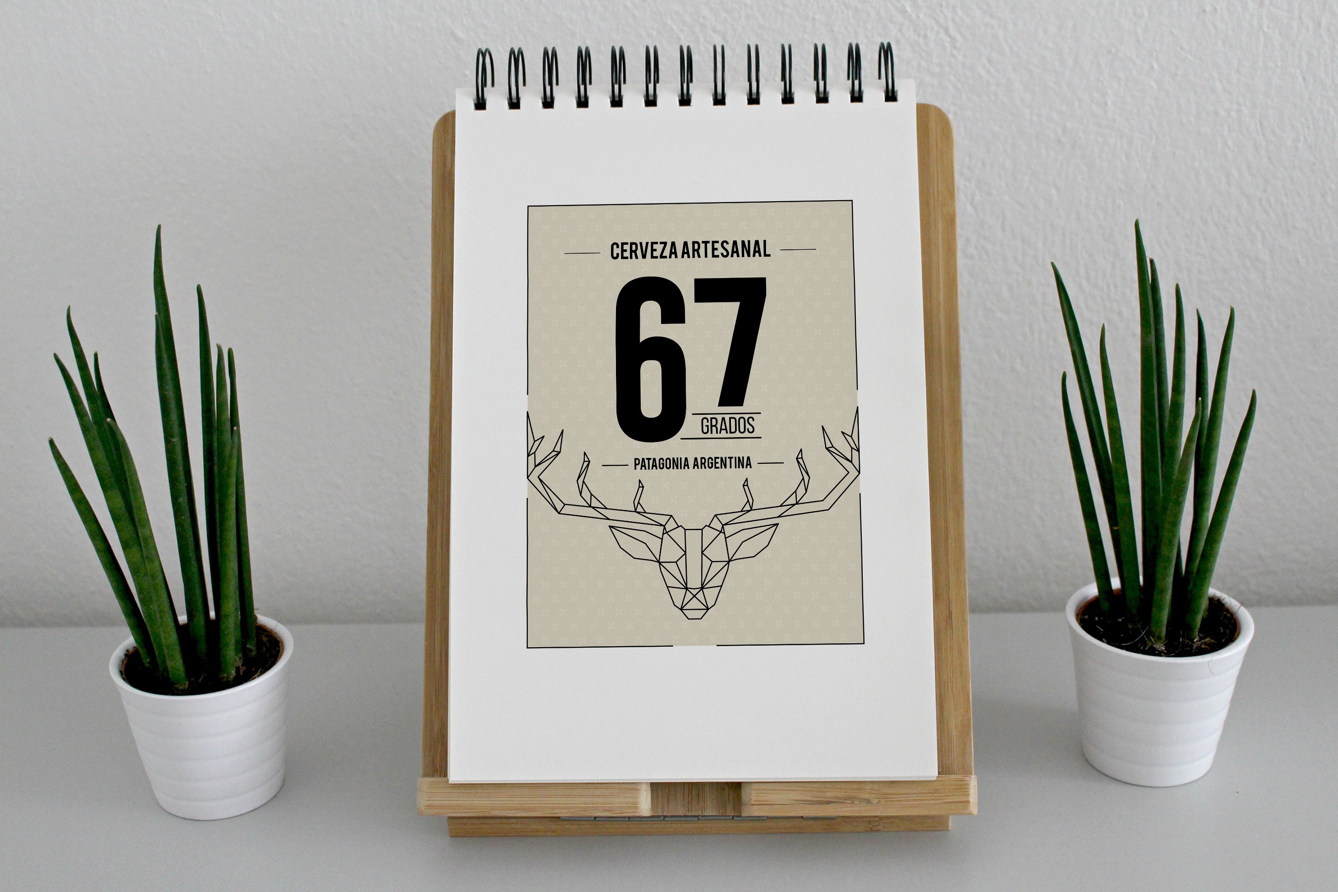
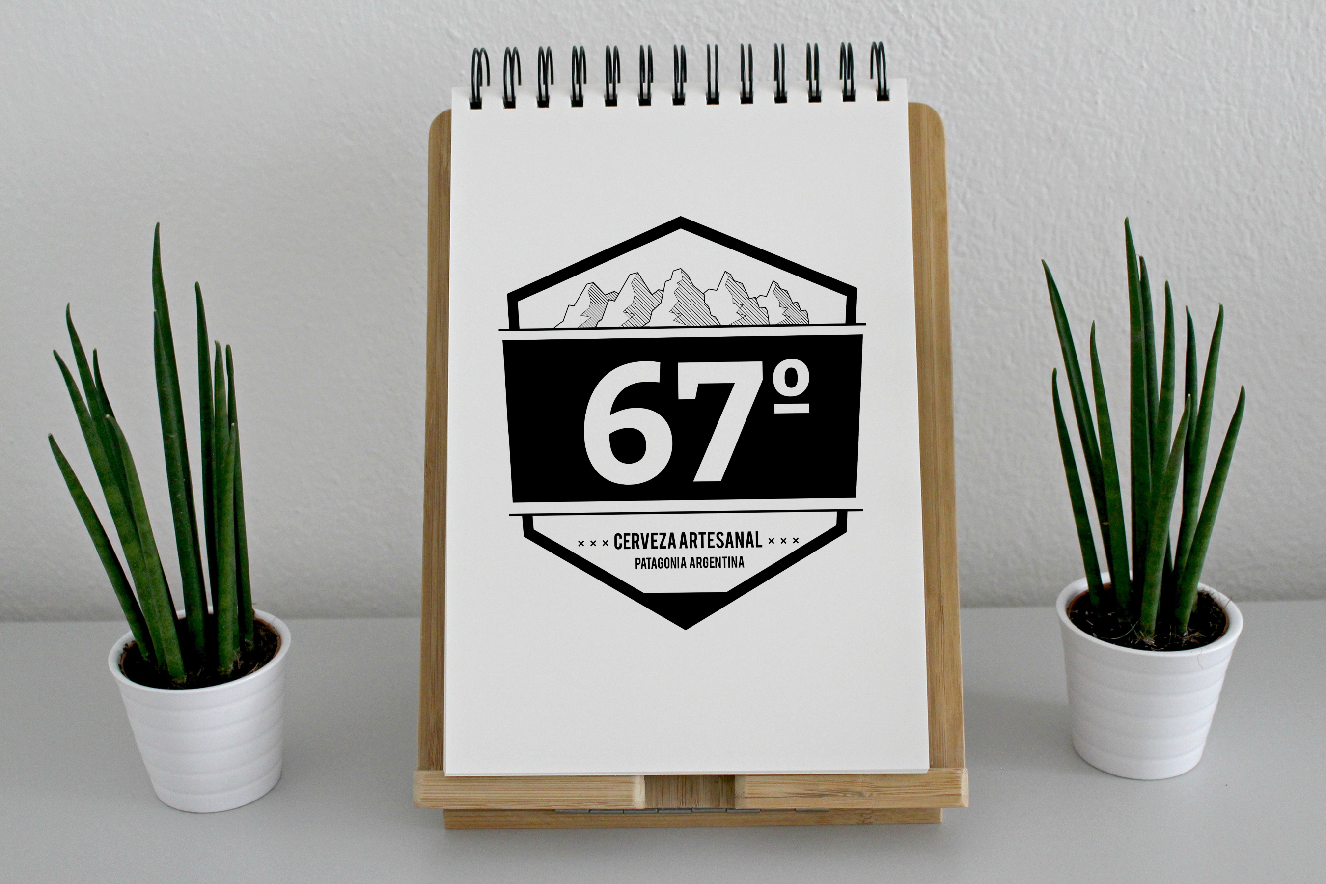
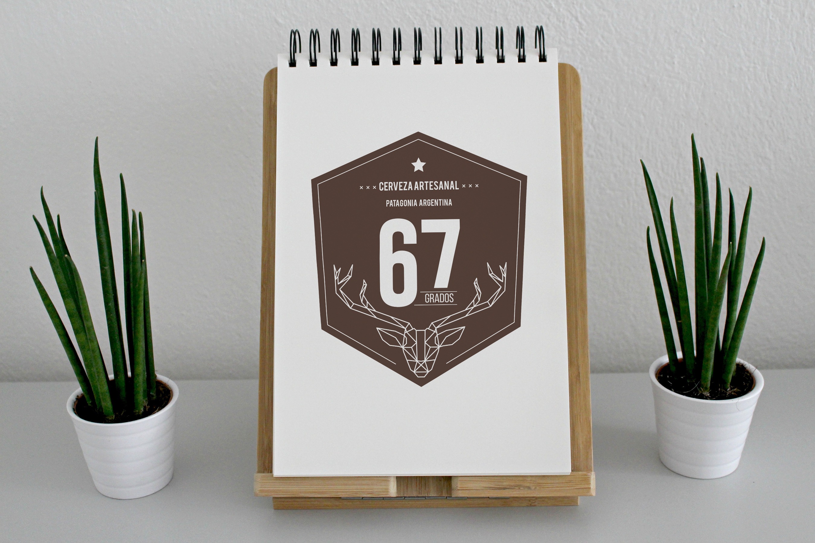
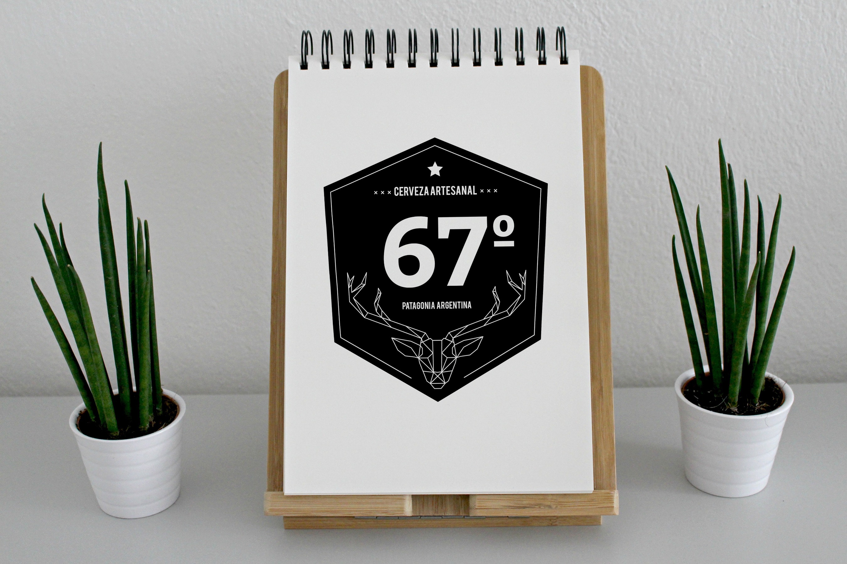
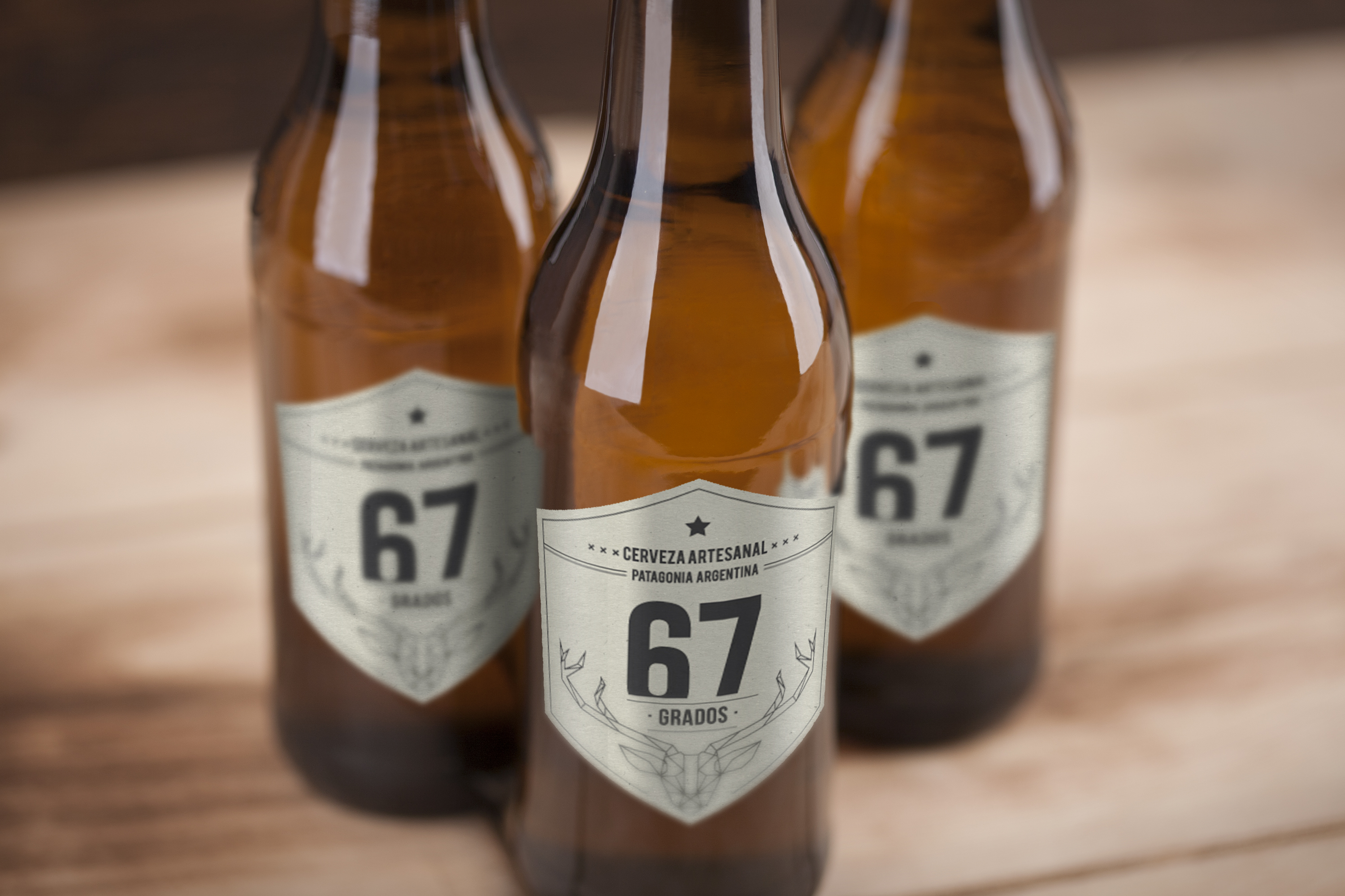
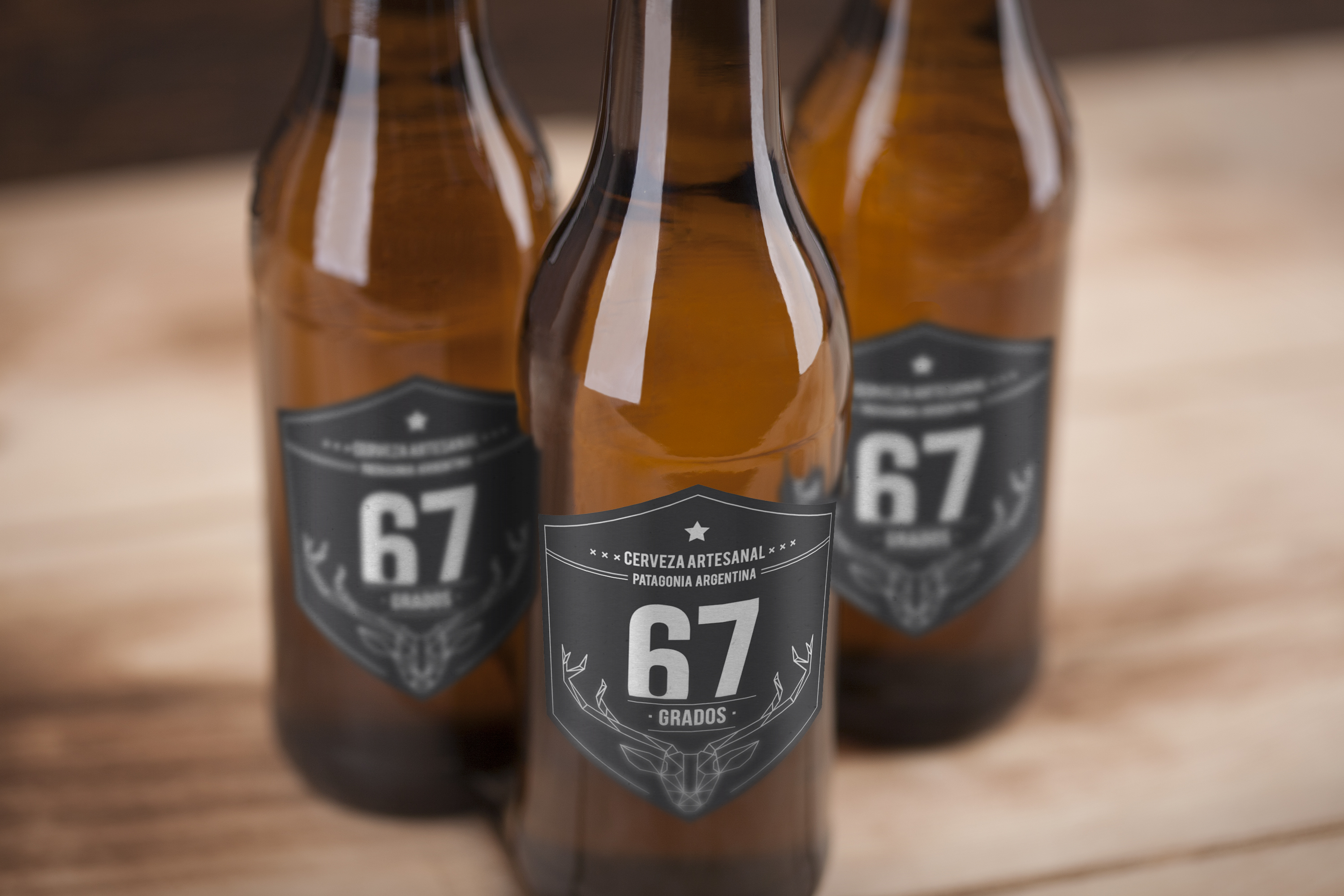
Based on the sketches, we decided to go with the deer as a Patagonian icon, using the hexagon shape.
I tried different layouts and design, and the client chose the ones he liked the most. Then I made a darker design for the black beers, and a lighter one for the blond ones.
