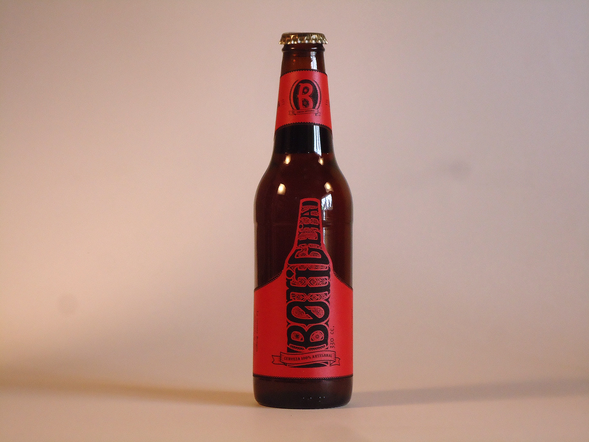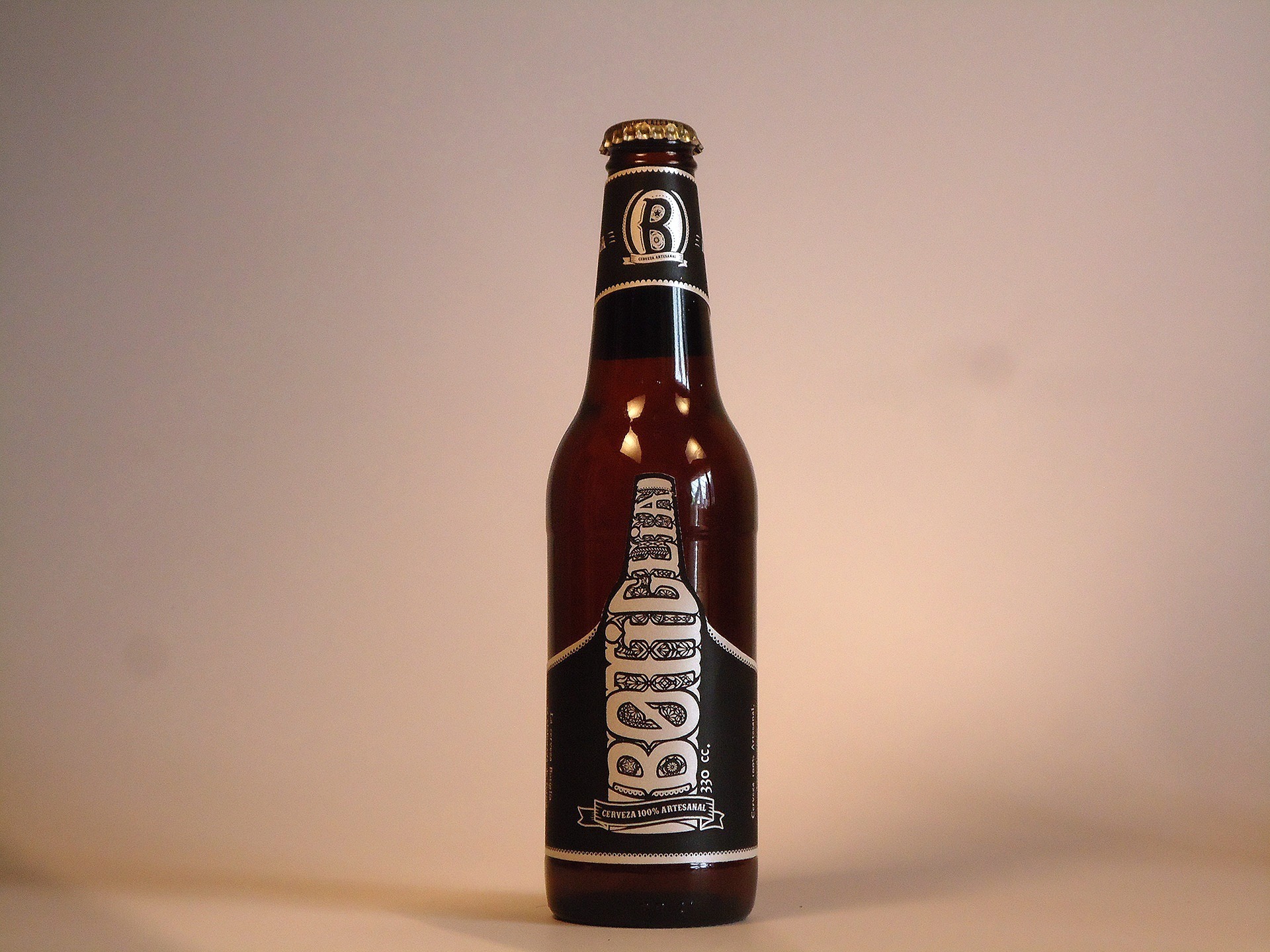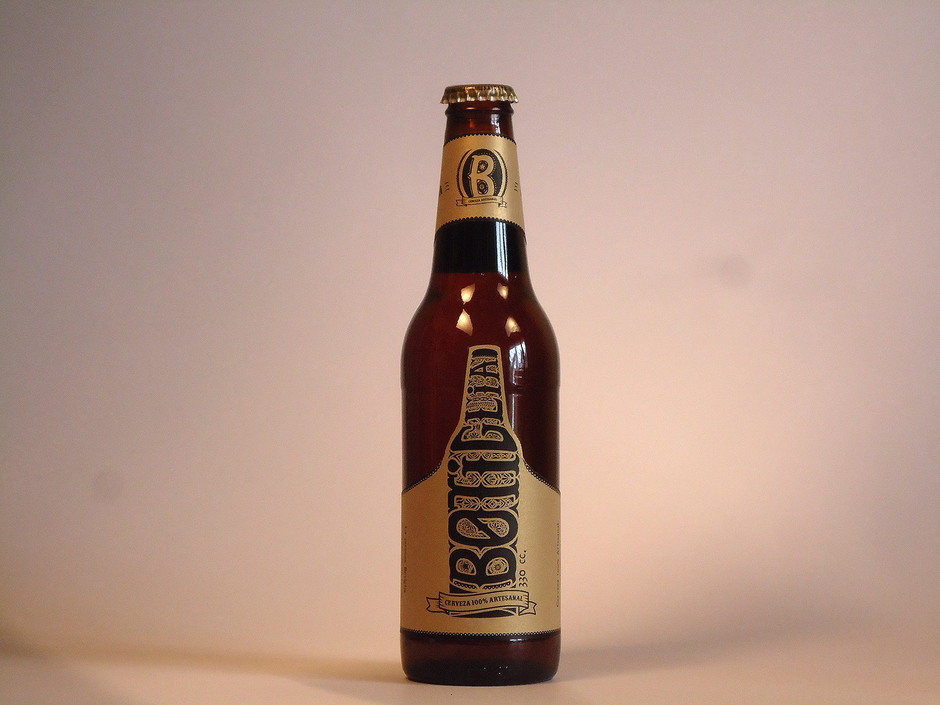
But a few weeks later, the name of the brand changed, so we went back to the start and began working on the new name and the concepts behind it. The new name was “Botiglia”, which means bottle in italian. So I took the name of the brand as a trigger in order to develop some design proposals.
After making some sketches, we discussed them and the design that the client liked the most, was one inspired in the Mexican Calaveras art style. I arranged the typography following and constructing a bottle shape, with some details and arrangements that ended up completing the figure.
Afterwards, I designed the beer labels, and helped the client to decide and choose the printing system, the type of media and the complementary graphic operations (coating, cutting, etc). I used the same design for every kind of beer, and changed the colour of the paper for each type.
