With a sustained production, El Masón found himself in the need of having a brand and labels in order to introduce the product into the market.
In July of 2016, we started discussing ideas, concepts and concerns to work together in the development of a visual identity.
Since the name of the brand makes reference to the Masonry, (a fraternal way of organisation that had a strong development in La Plata city at the beginning of the XIX Century), right from the beginning the idea was to develop an identity incorporating emblematic elements of the Masonry together with elements related to the beer crafting.
After researching in the origins and the evolution of the Masonry, I decided to take it’s humanist nature as a starting point to look for conceptual and visual elements.
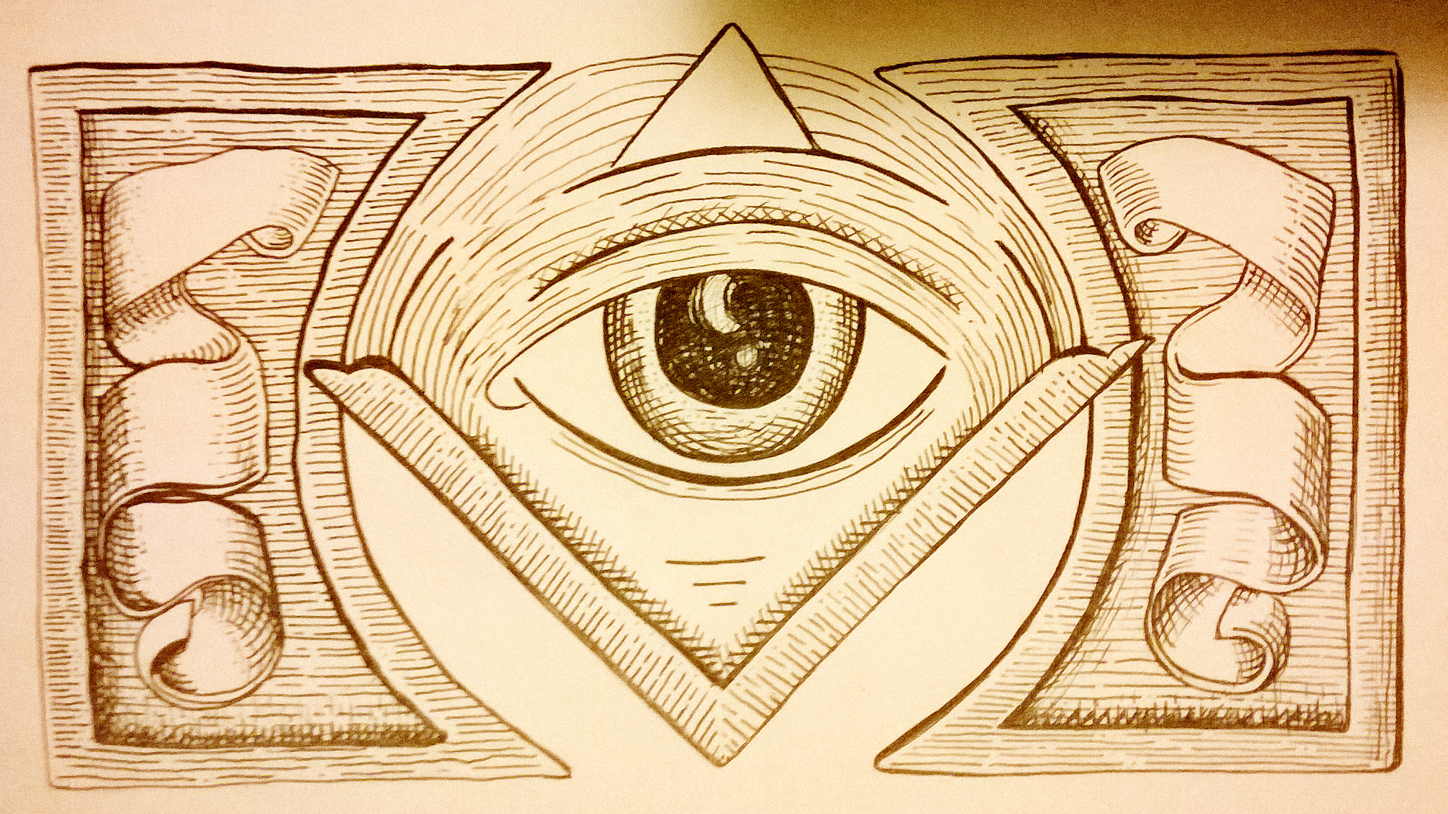
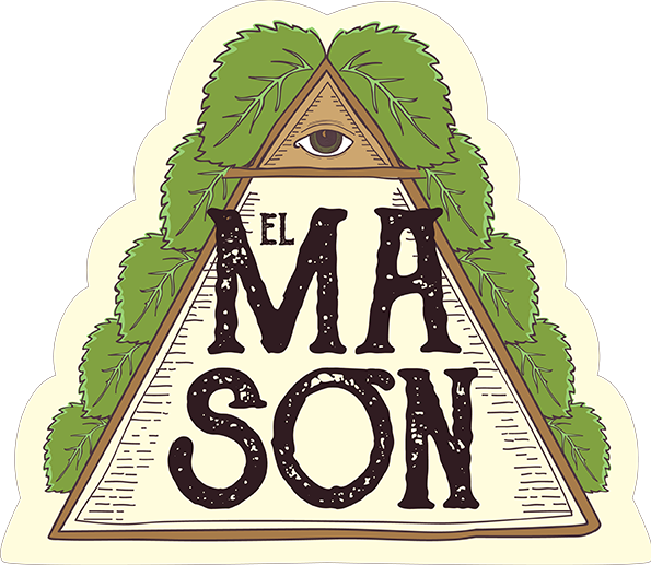
The hierarchic structure of the Masonry was a central focus from which I started to breed the first ideas. I incorporated triangular shapes (referencing the carpenter’s square used as a symbol of virtue), and the compass (symbol of the limits between which every Mason must step concerning the others).
In my first sketches I incorporated a Mason as a central figure, as well as I used an illustration style similar to the filigree, emulating the appearance of the printing systems of the time.
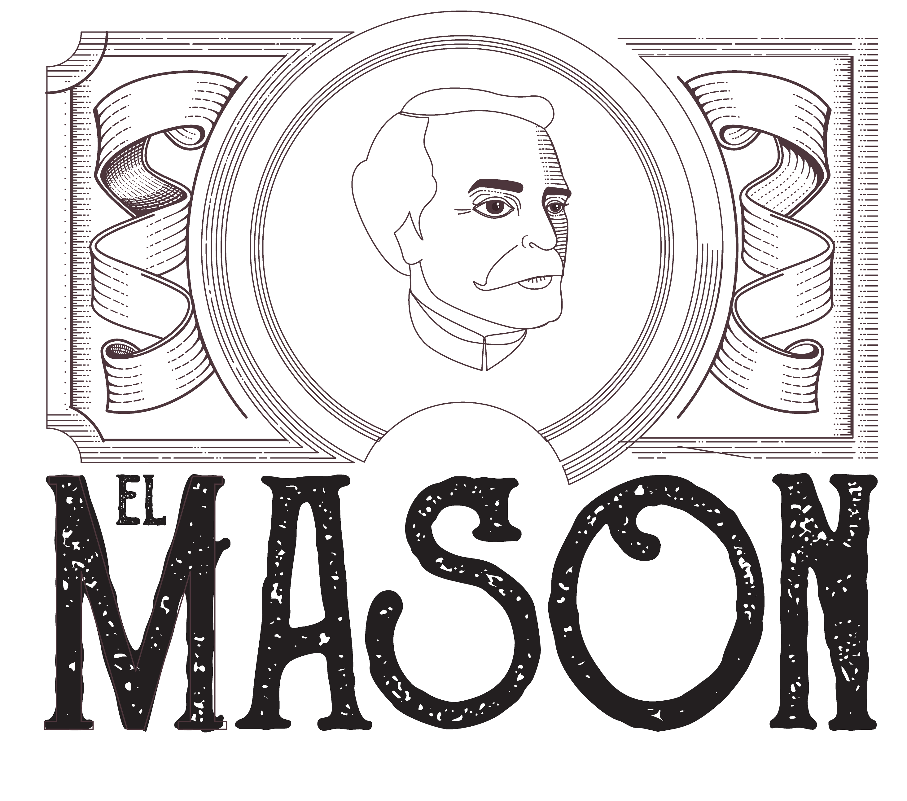
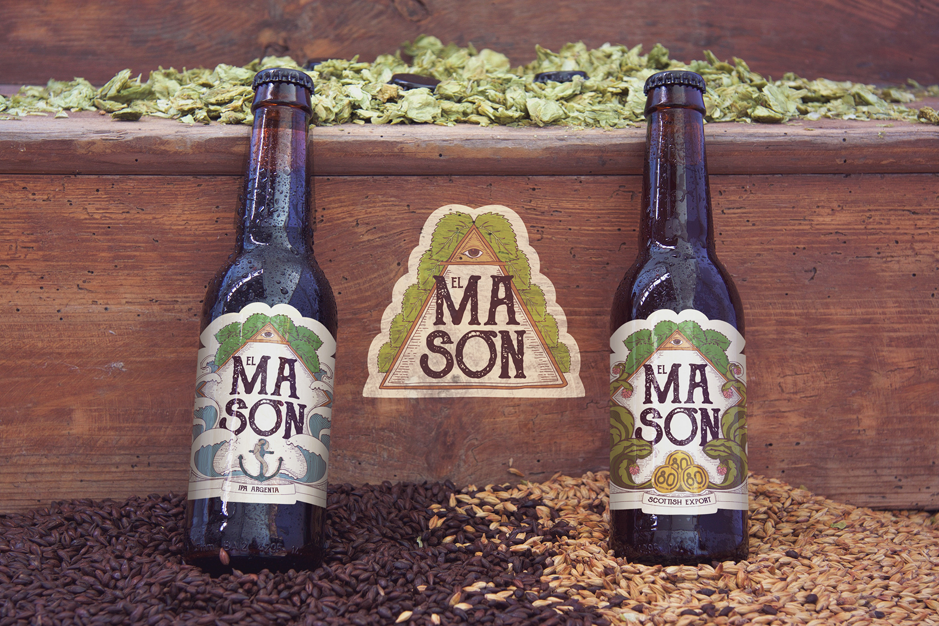
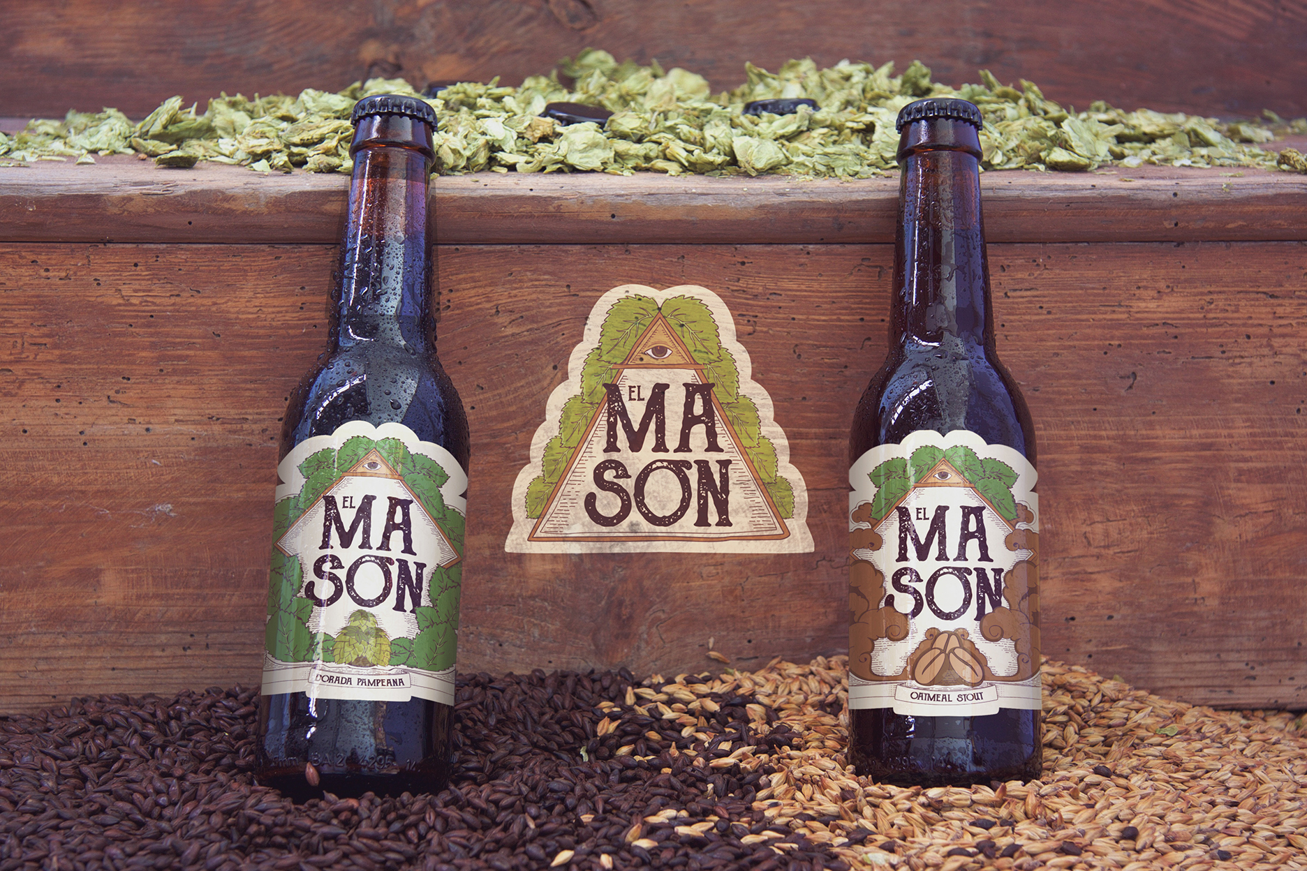
After sketching out different ideas, we opted for removing the main figure in order to develop the brand in a conceptual way.Since the variety of beers crafted by El Masón is delimited and steady, we decided to make a main design that allows for the development of a subsystem of lavels to identify each kind of beer.
Then, I designed a brand with permanent and unalterable elements: the name of the brand appears as a central element, framed in a triangular shape. Above it, The Eye of Providence shows up, representing the watch of God over the humanity (a symbol widely used in the Masonry). Peeping out from the triangular shape, some hop leaves make reference to the main plant from which beer is made.
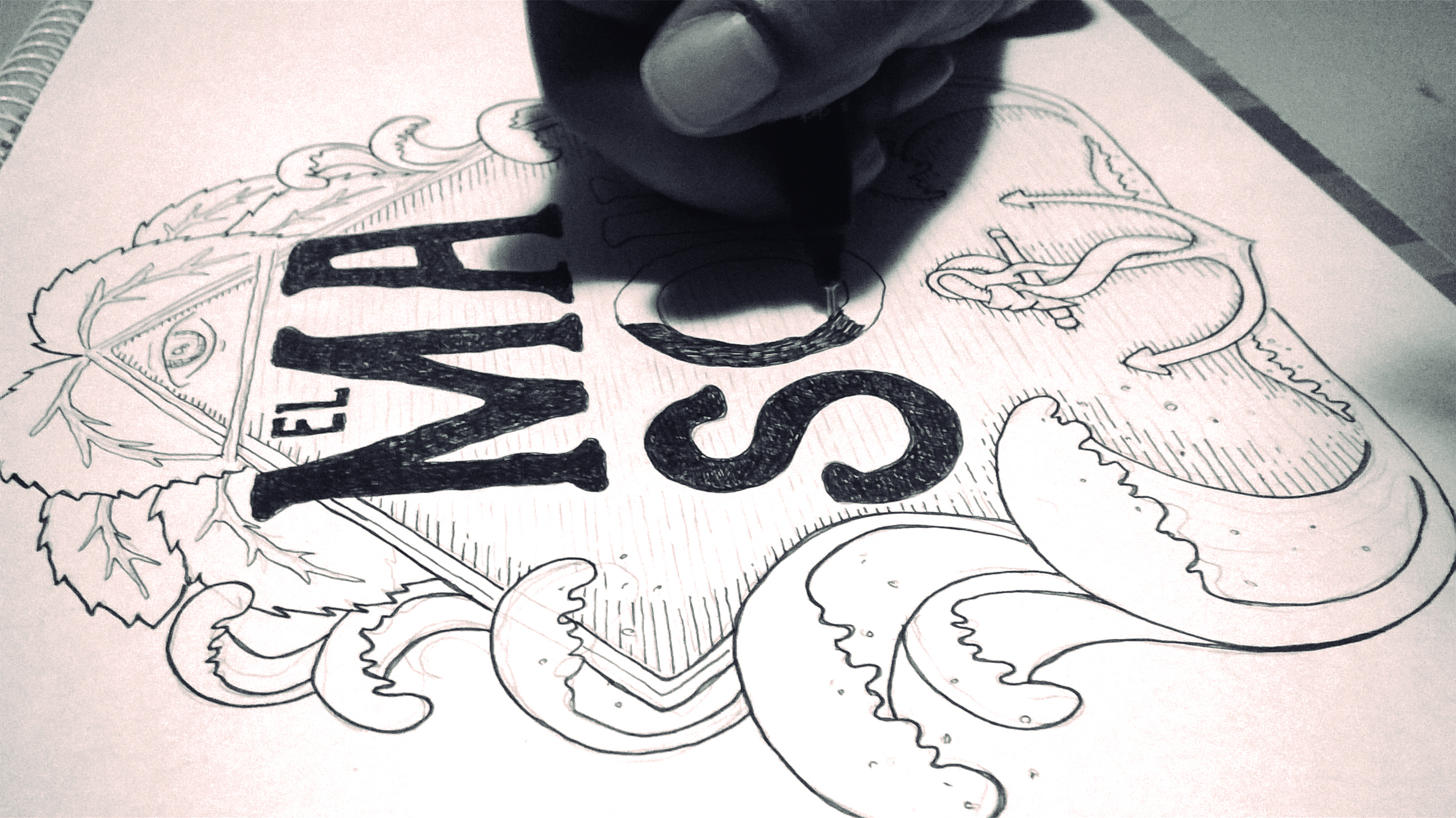
Based on the brand, I started making some sketches for the labels.
I rearranged the elements and added a space below, in order to place different elements for each kind of beer, but maintaining the structure, the colour palette and the graphic style for every illustration.
In this instance, I started developing the design of each label.
Once the client approved the design of the labels, I scanned them in order to add the colour and make the final adjustments.
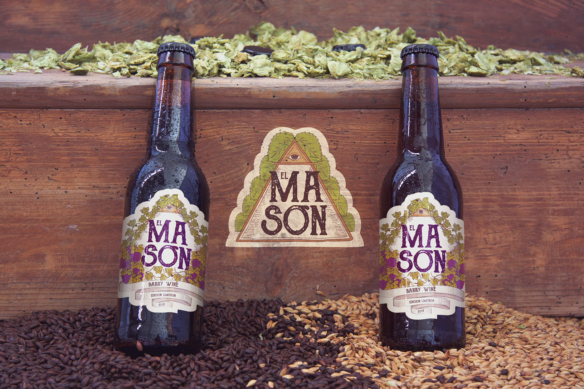
A few months later, the guys from El Masón contacted me for a new design. They were brewing a special edition of Barley wine, and they wanted a label for it.
They slightly changed the name from Barley to Barry (as one of them is named) and trusted me the whole process of design.
Following the main style of the labels, I came up with a design that included grapes, which are the main ingredient in whines. I used leaves but, instead of leaving the hop leaves, I replaced them with vine ones. Finally, I adjusted the colour of some leaves to a warmer tone in order to unify the colour palette.