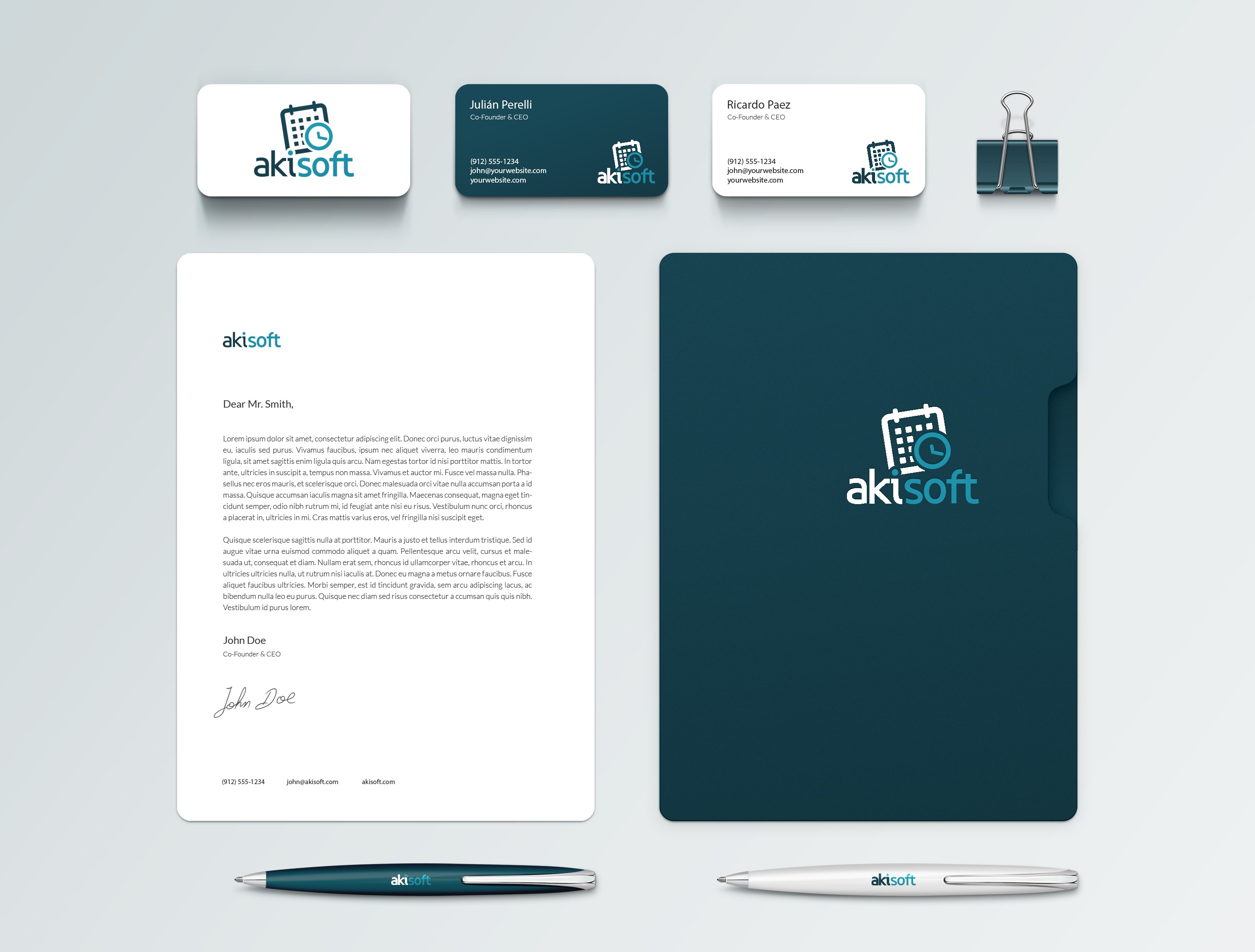
They came to me with the idea, and we decided to work on a brand in the first place.
We discussed the concepts that they wanted their brand to convey, and I started working based on that.
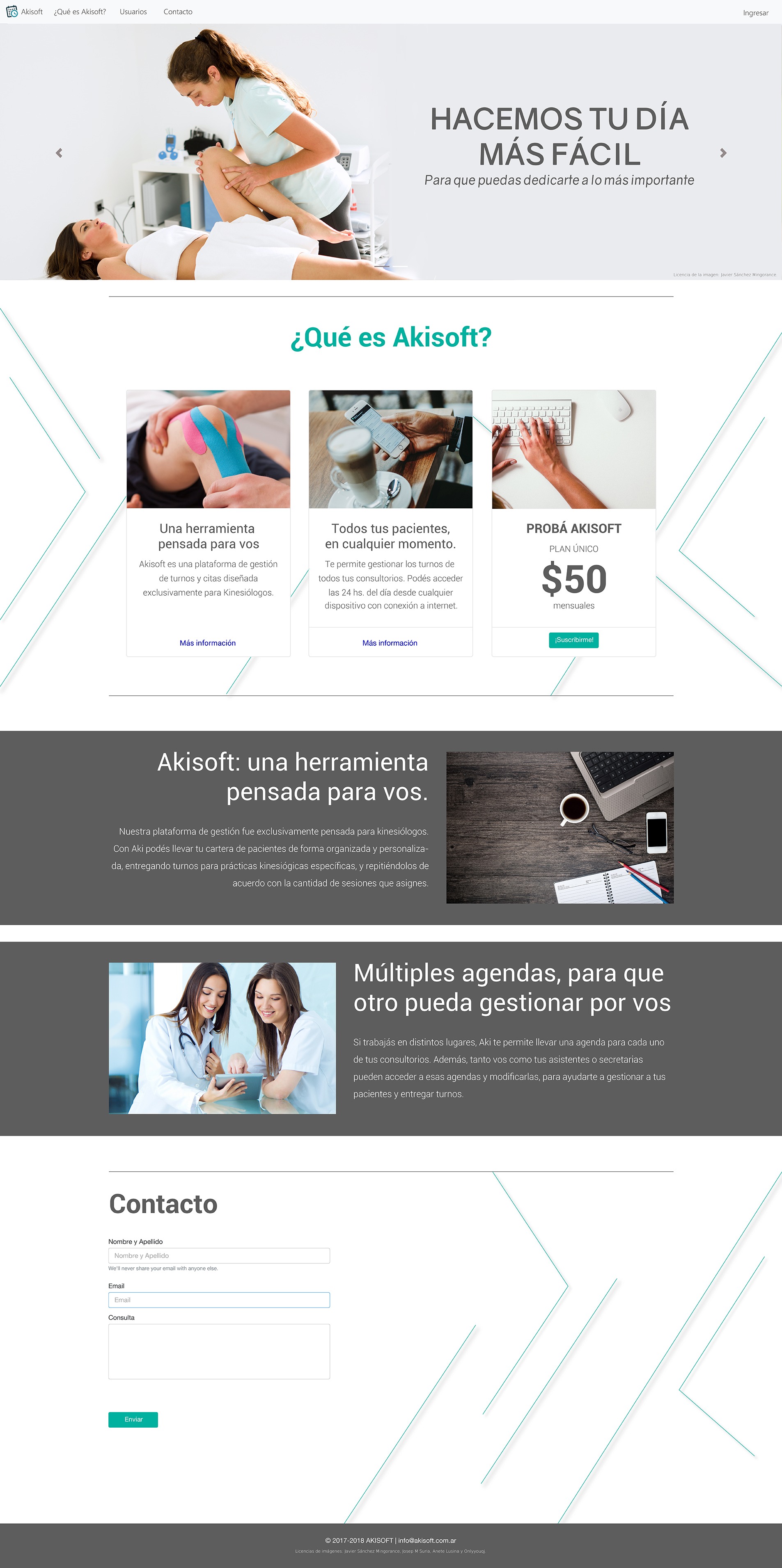
I thought of a clean brand, that made an allusion to health, technologies and schedule organization.
I made the first sketches using console fonts, in order to allude to the technologies behind the system. I added a calendar as part of the logo, and then I created a colour palette with tones often used in health environments.
After discussing the options with the client, I made some adjustments, and the brand was ready.
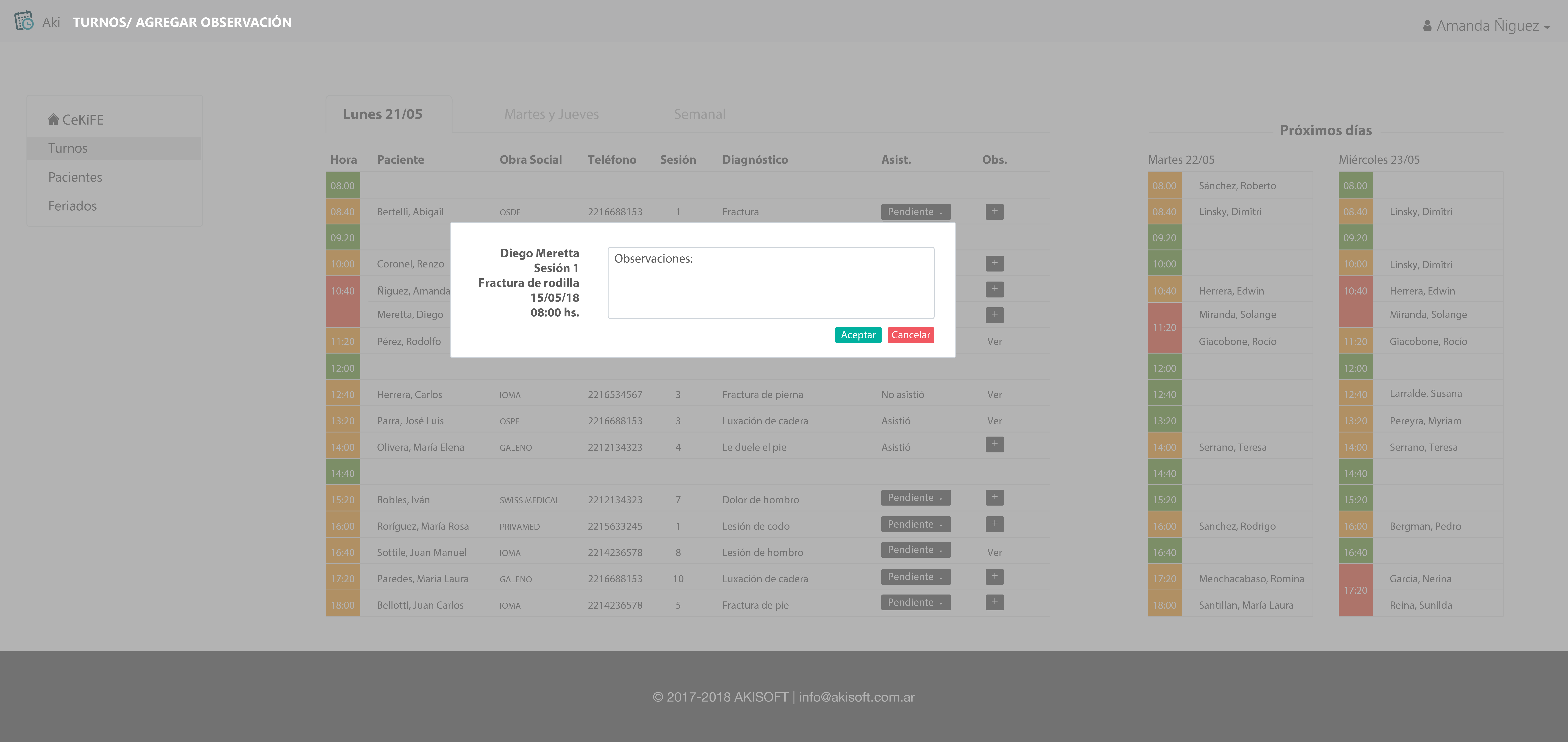
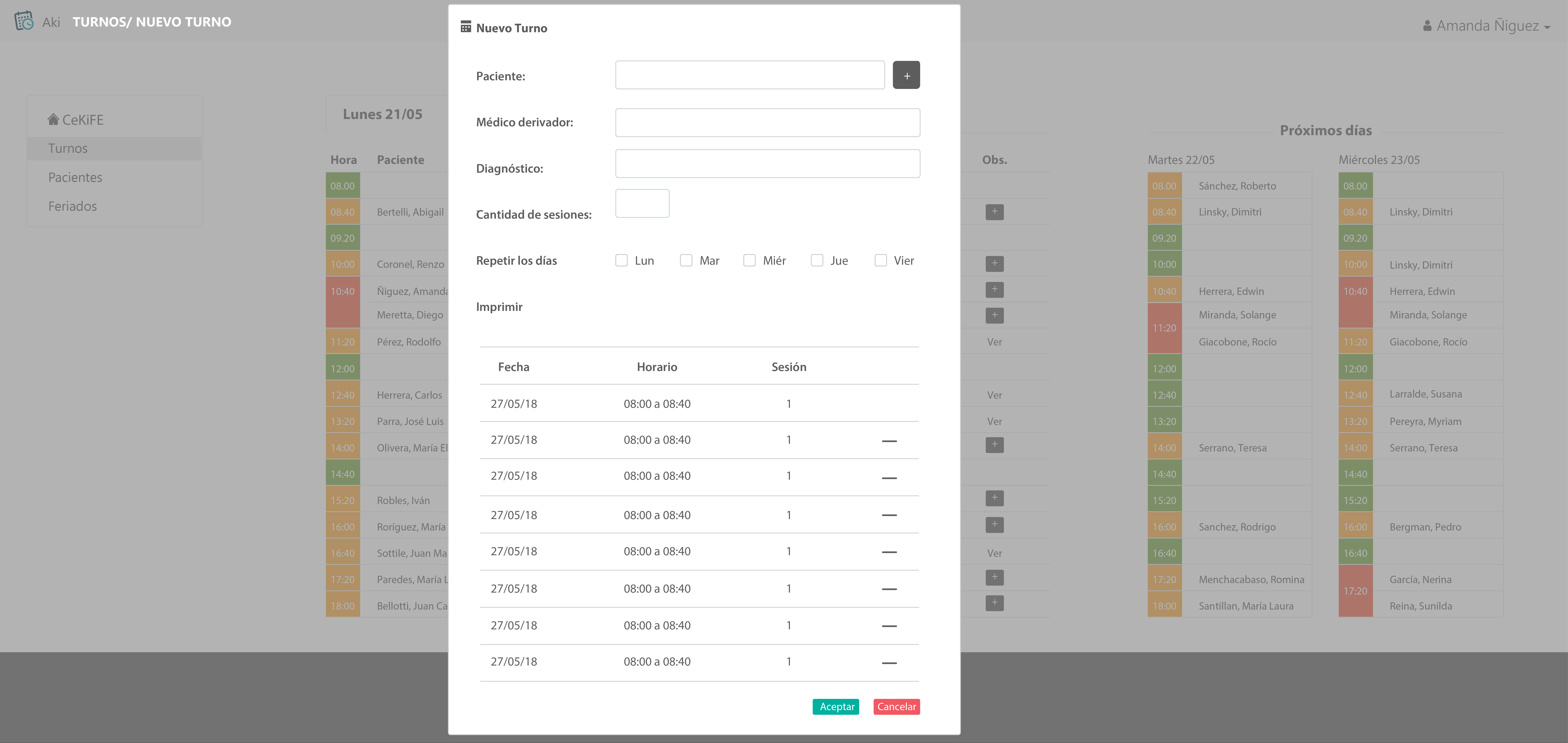
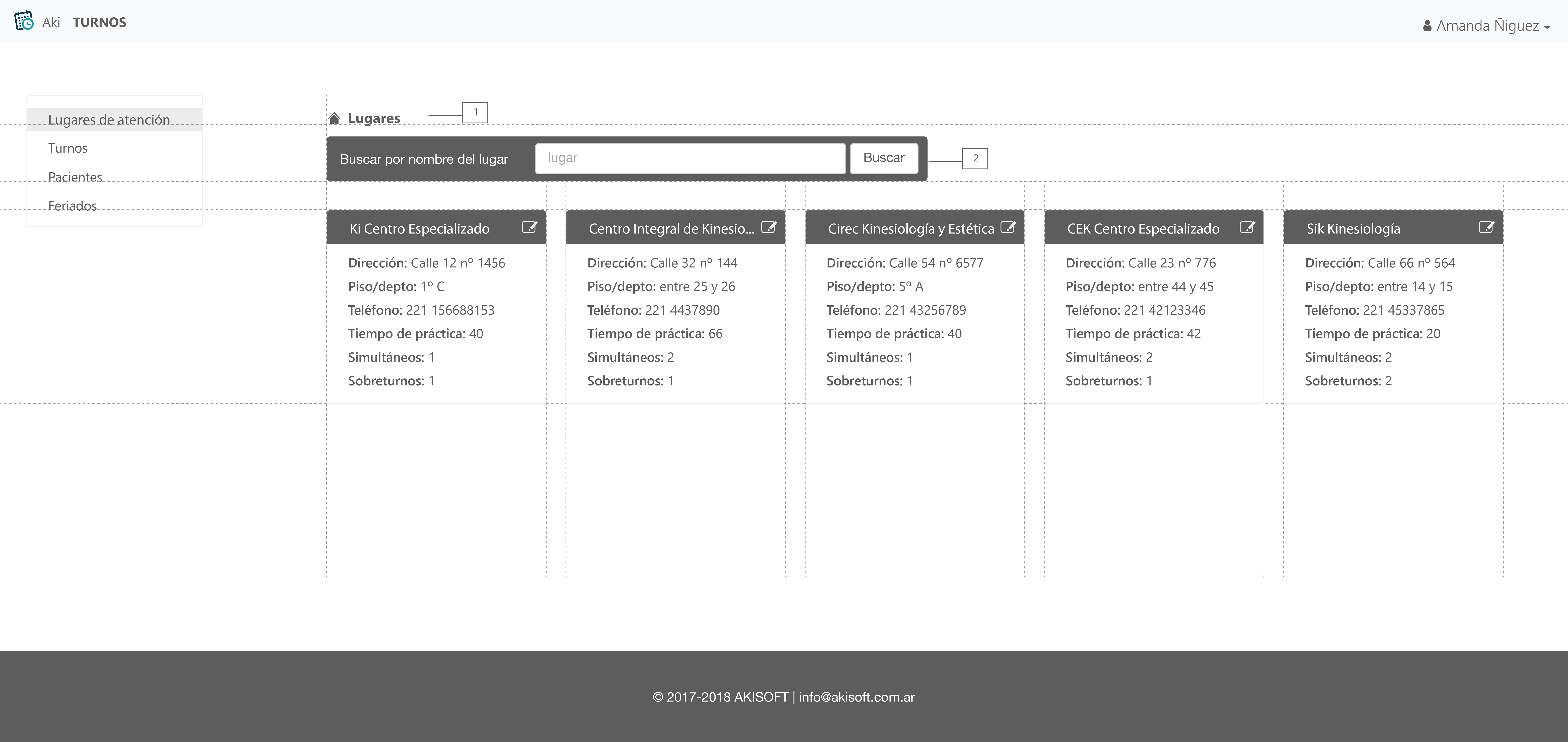
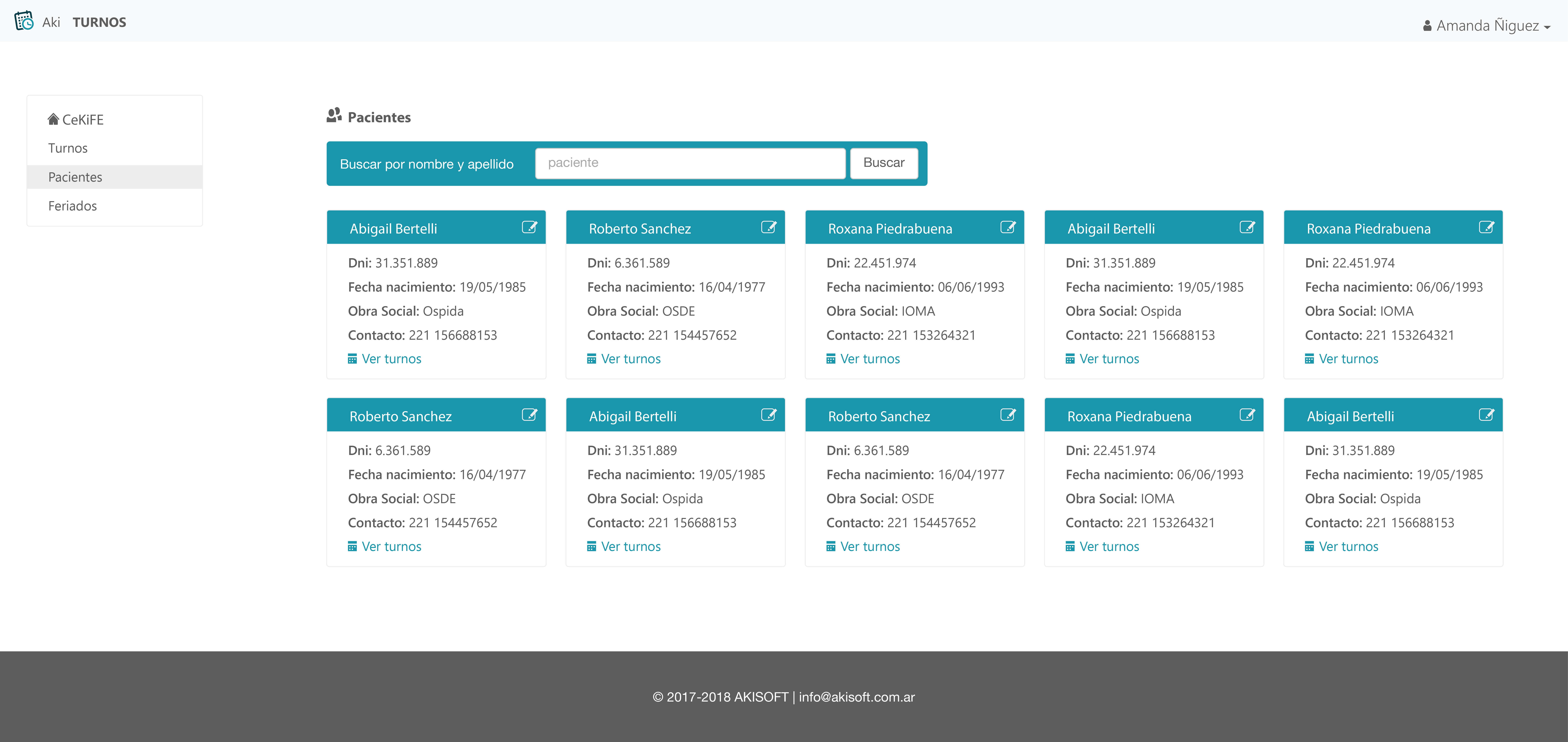
So the next step was defining the design needs of the product. We established the sections that the service needed, and then I defined the main layout.
Afterwards, I designed the structures of the sections, and made the adjustments needed as I tested the product.
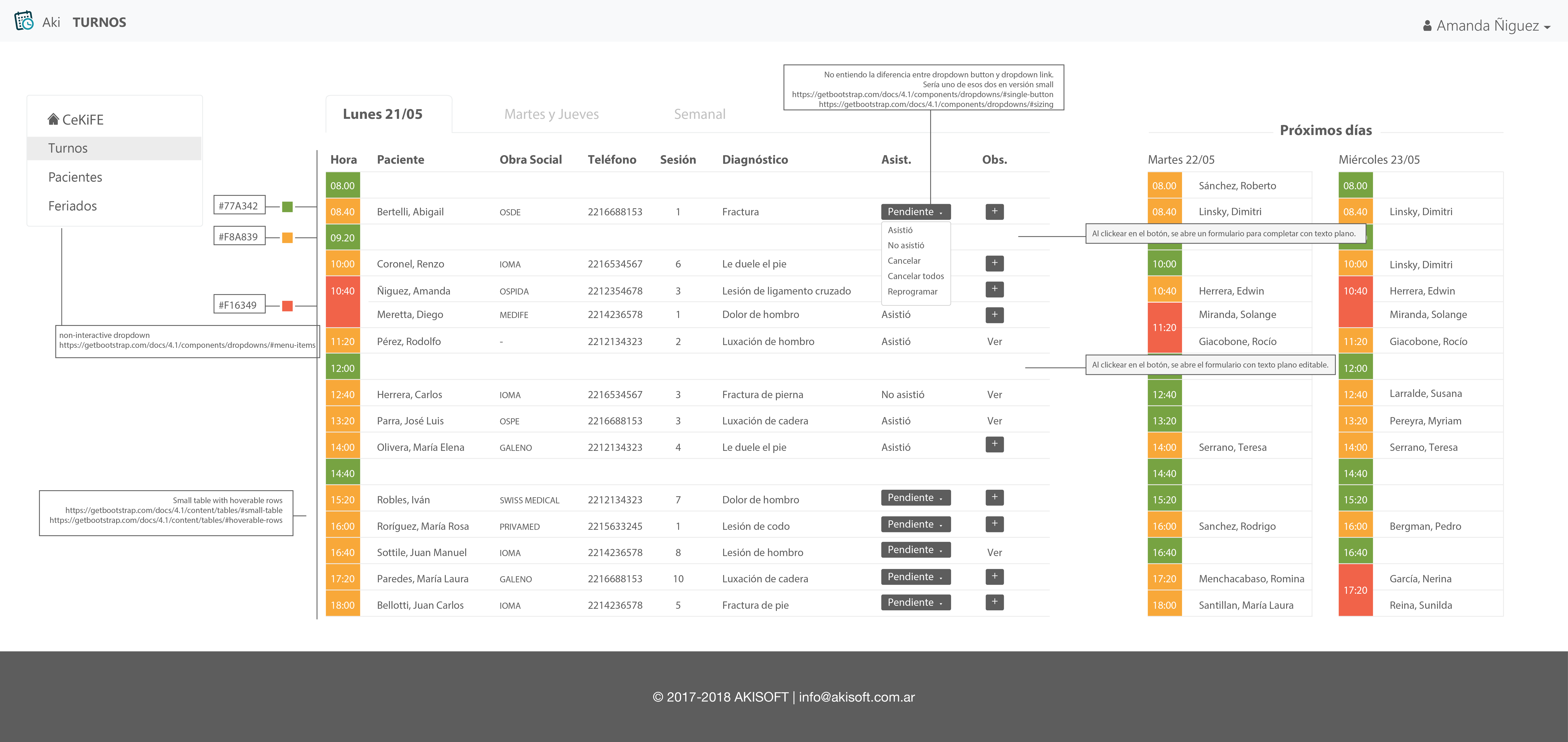
I sent the design mockups to the client, with colour codes, links to the design elements that I used, and notes about the design.
Once the system was ready, the client needed a website in order to sell the product. So we established the paged that they needed, and I made the web design for Akisoft.