The people from Salvador Mazza came to me looking for a web design, since they needed a formal channel of communication.
As they explained their motivations and objectives to me, we looked at the graphic elements they were using on their daily communication. It quickly became evident that they had no professional designers in the group: the design pieces were made by a few doctors during their little free time.
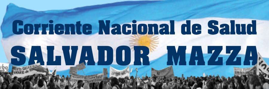 The identity that they were using had a photograph of a march, an argentinian flag, and the name of the organisation in a strong typography.
It was a strong image, but it was too complex to be used as a brand, and lost strength when applied in black and white.
So I offered them working on an identity first, and then moving on to the website design.
First, I started working on the typography. I looked for a font with a similar style to the one they were already using, and worked on the name, making the necessary adjustments to the shapes of the characters.
Once that the typographic design was ready, I started making some sketches trying to include the Argentinian flag in a more iconic way, and maintaining the main colour scheme (since the blue and the light blue worked very well).
Since they are an organisation with a clear and consistent ideology, I thought it would be important to establish a strong institutional image. I did some research, and I took notes of the graphic elements used in political parties, and in institutional entities.
So with the customised font, I started trying different elements and layouts.
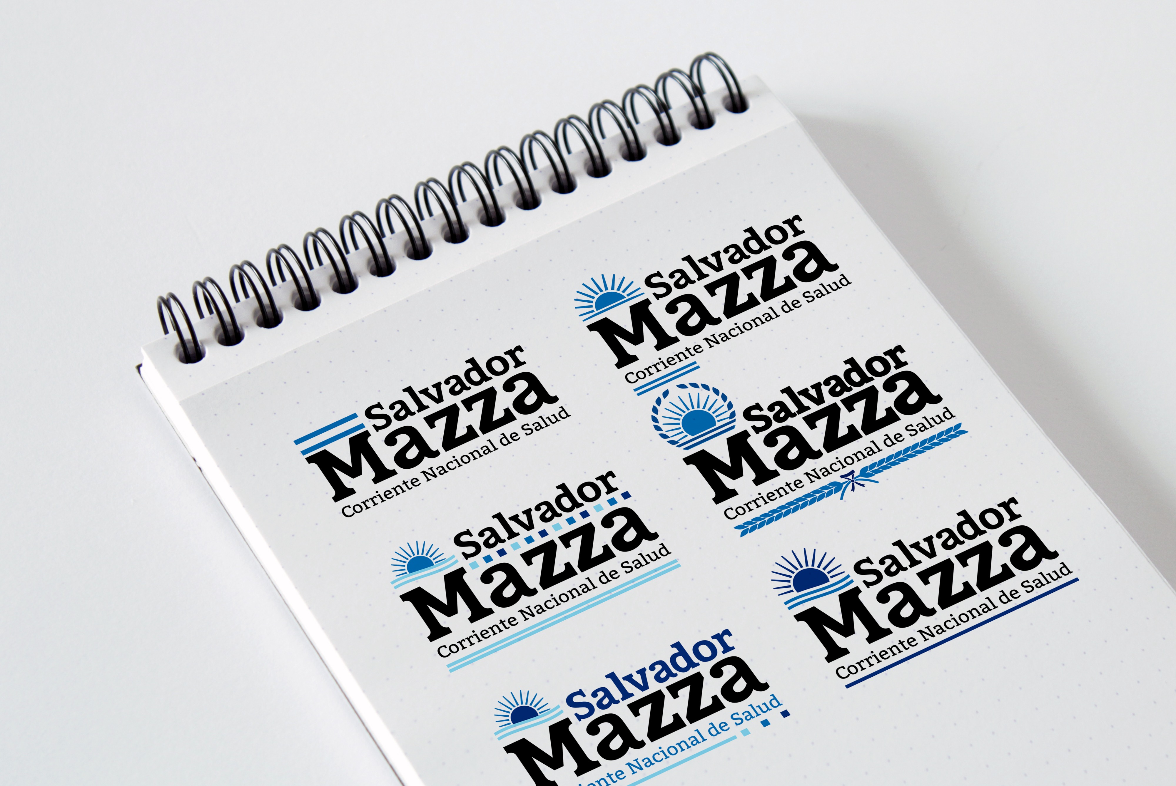
After discussing the options with the client, we decided that we were on the right direction. However, I felt that something was missing: the brand was somewhat formal and stiff.
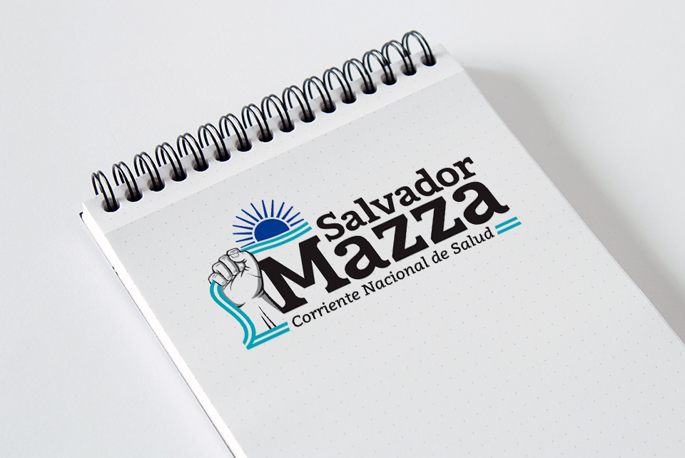
They were fighting for the public health in the whole country. They needed something bold.
So I included a fist in the design, I added some shadows to the illustration and I also added some movement to the ribbon with the Argentinian flag colours. After some final adjustments, and the design was ready.
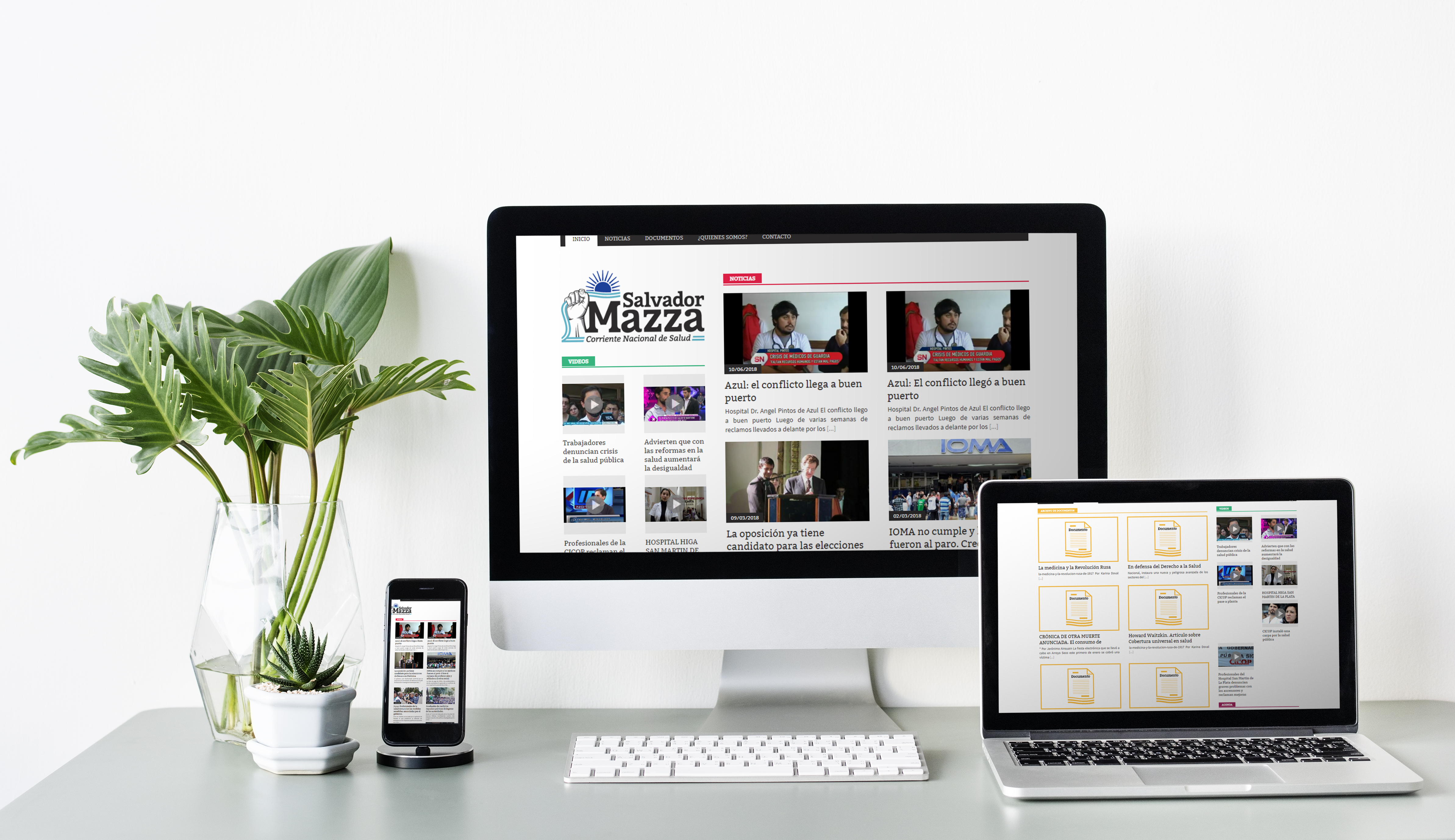
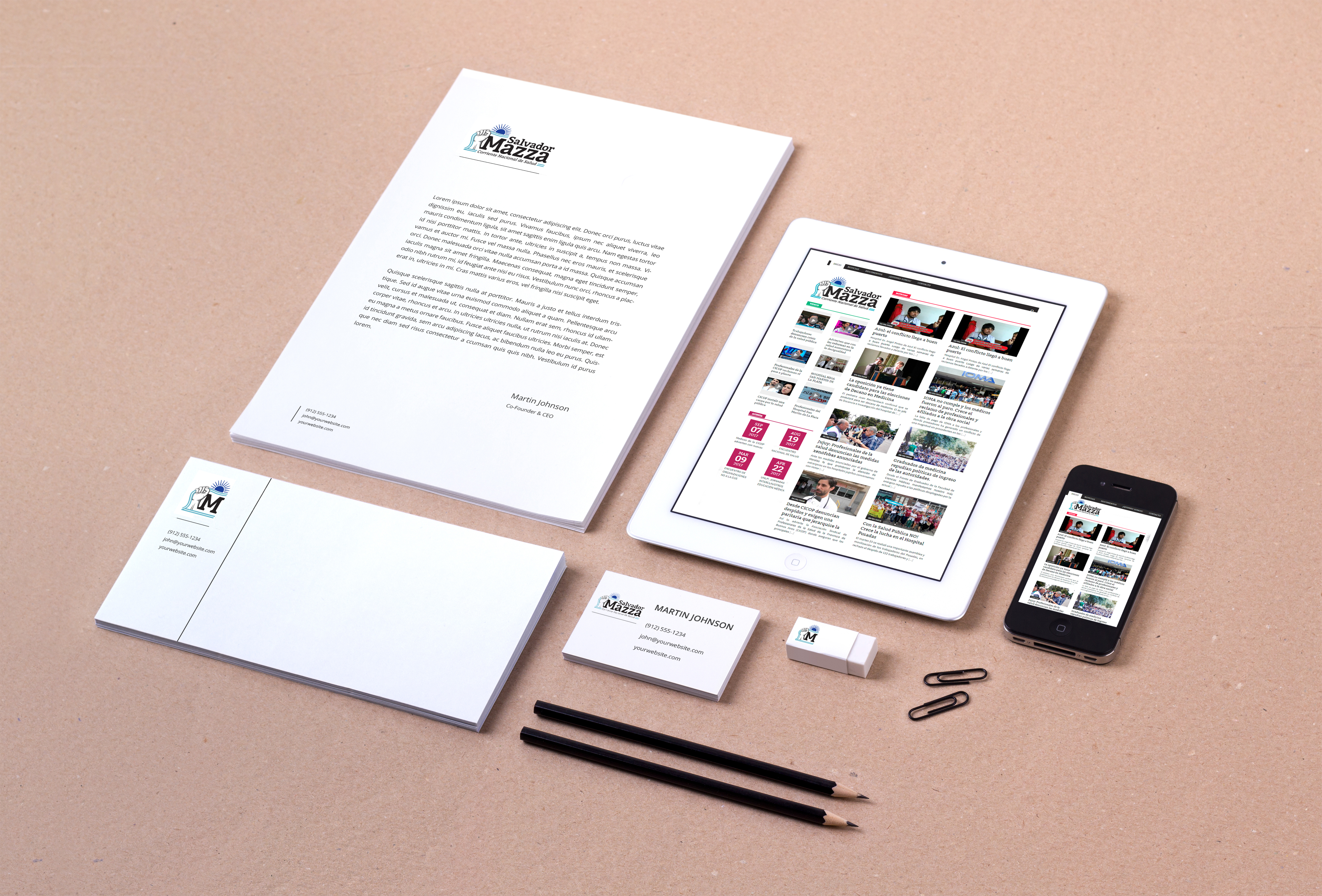
With an established identity, we started working on the website. We defined the type of information that they needed to give, and the way they wanted to display it, and then I set the sections and the general layout.
Defining the technologies for the site was the first challenge, so I contacted a programmer in order to work together.
The site was meant to be managed by several people from all over the country, with no experience in managing web sites, and using different devices. So we decided that wordpress was the best content management system for the site.
Then I looked for an appropriate template, and when I found one I liked, I started customising it. I designed some icons and placeholders for the content without images, we added a calendar, a video section, and media sharing buttons.