We discussed some concepts behind the brand and the products, and we also tried to define the customers to which the products targeted.
We decided to go for a romantic, feminine and modern aesthetic, and then I started sketching.
In the first place, I made a typographic selection, trying to define the style of font that I wanted. I discarded the less appropriate styles, and ended up with a few possible fonts selected.
Then I started sketching. I knew for sure that I wanted to incorporate come botanical elements, but I wasn’t sure how. So I started trying different styles, colours and layouts.
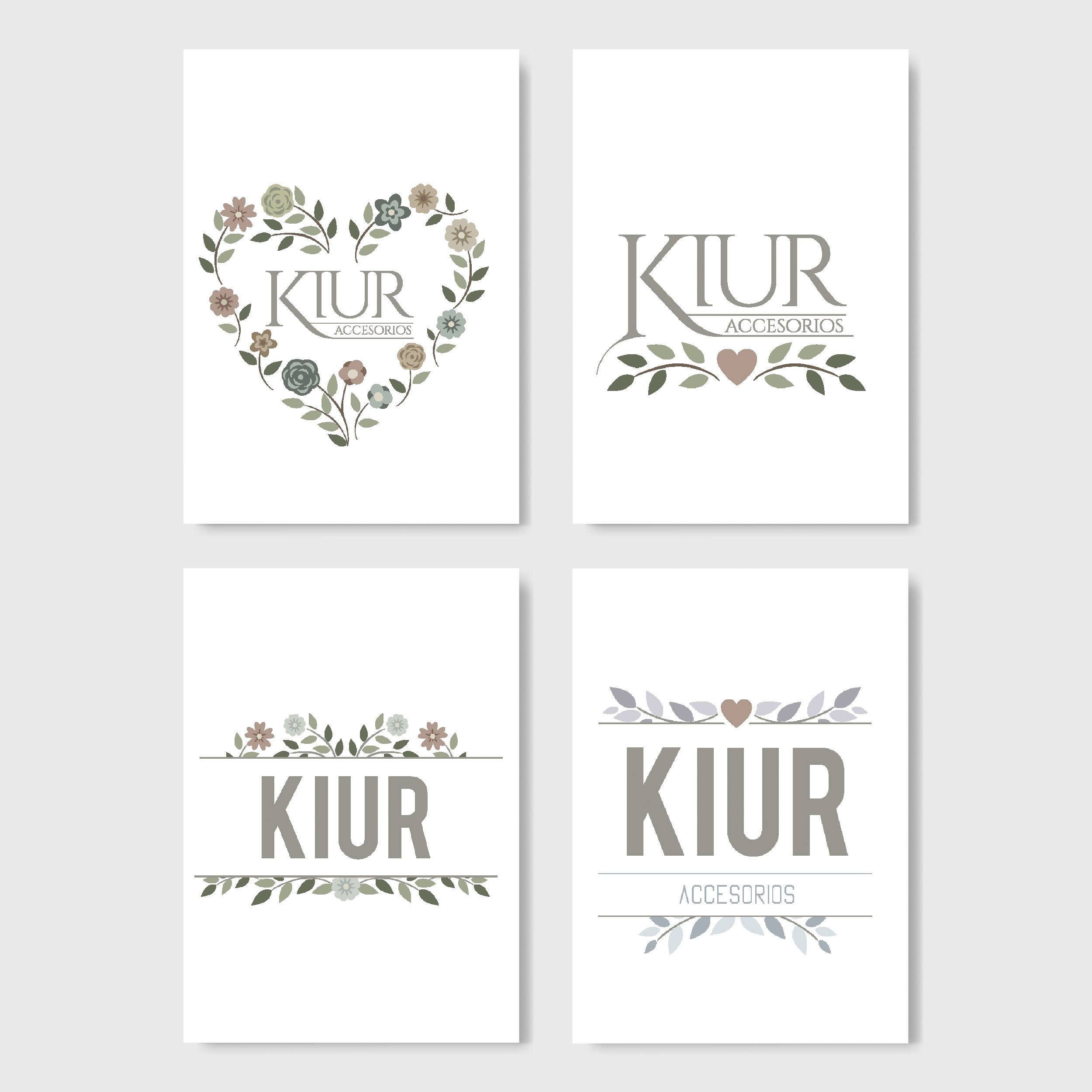
I wasn’t sure about the sketches. The vector image wasn’t strong enough, wasn’t modern and seemed more juvenile.
So I decided to try the flowers as a background texture, and as a main texture for the letters. I made some new sketches, and I knew I was on the right way. The sketches had adjustments to be made, but the style was feminine, fresh and modern.
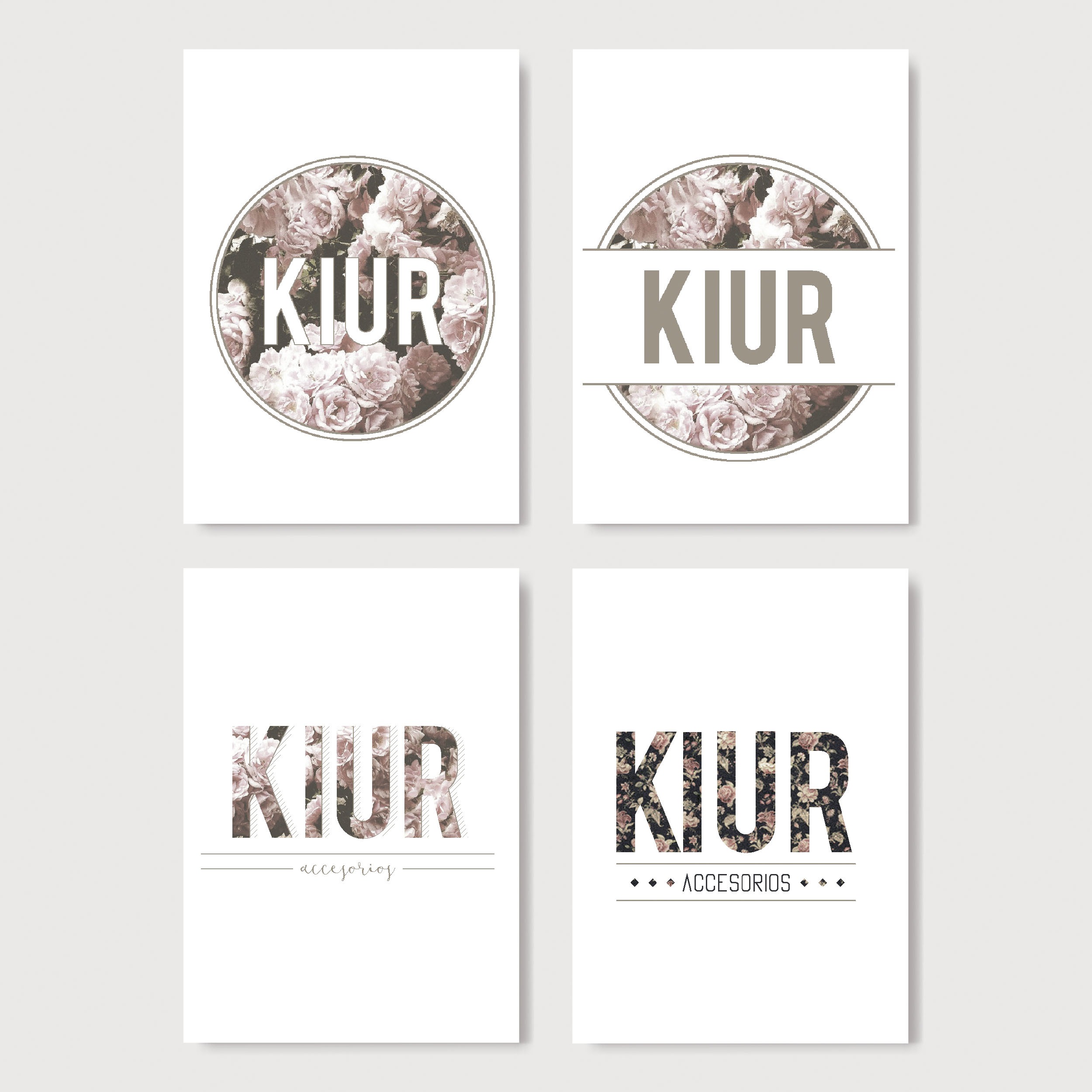
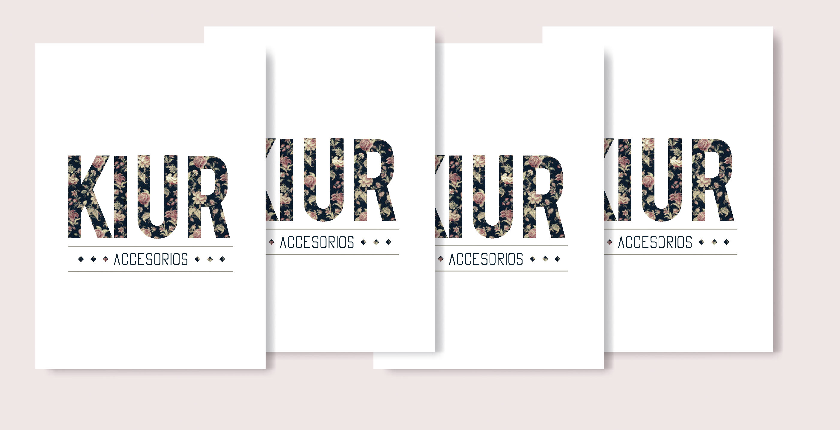
Although we liked all the versions, we decided to choose the simpler one, since having a round textured background could be an issue when trying to apply the brand. So we went with the last option, and after some minor adjustments, we had the brand ready.
I printed some labels with the brand, and Carla was ready for the fair.
Afterwards, we made some stickers with the brand, and we made additional labels with phrases in paper kraft, to go along with the main label. Also, we did a photo-shoot for social media, that turned out beautifully.