It was the first time that I developed an entire design project for a real client, so It was both exciting and a little overwhelming, but the teachers helped a lot during the whole process.
First of all, I started researching on mental health. I read on what It was, why it’s important, and whats involved when we talk about it. Also, I explored the graphic resources and the colour palettes used in mental health communication, and the reasons for that. Once I dove into the subject, I started working on the identity.
I set a few concepts that I wanted to be on the brand, but also defined some requirements that the brand should meet in order to work: the brand had to work on it’s own, but it also had to be starting point from which a whole graphic system could be developed. Once the brand was ready, I started working on a signs subsystem for the workshops and the products of the group.
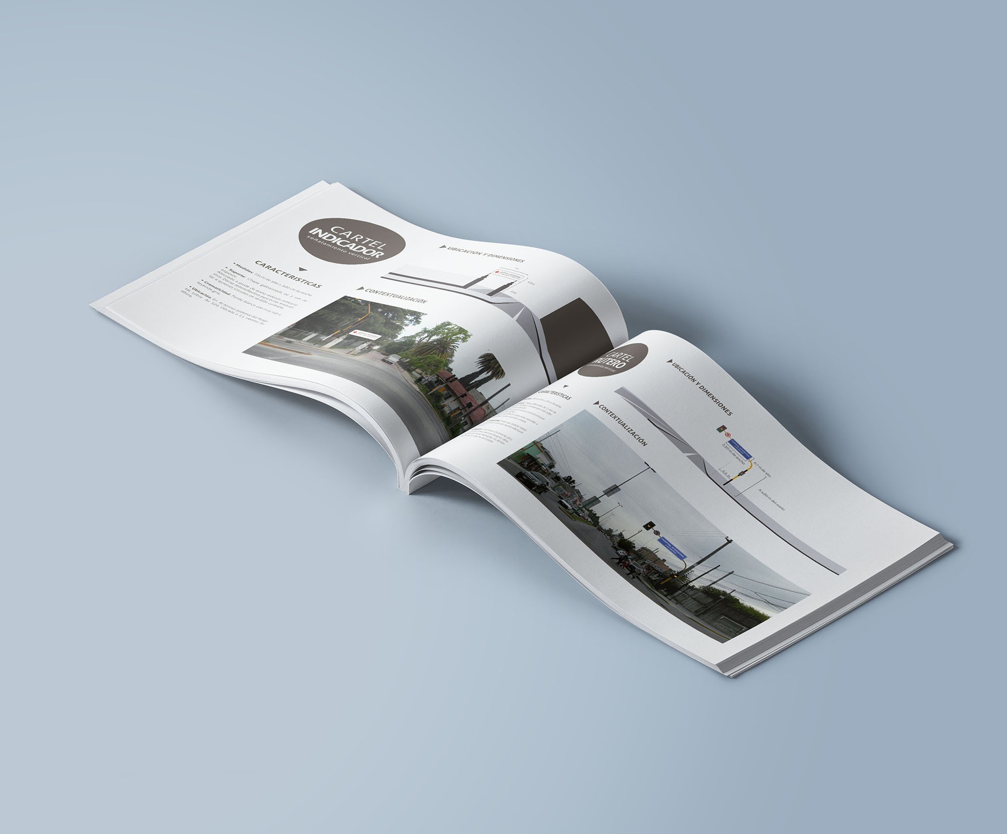
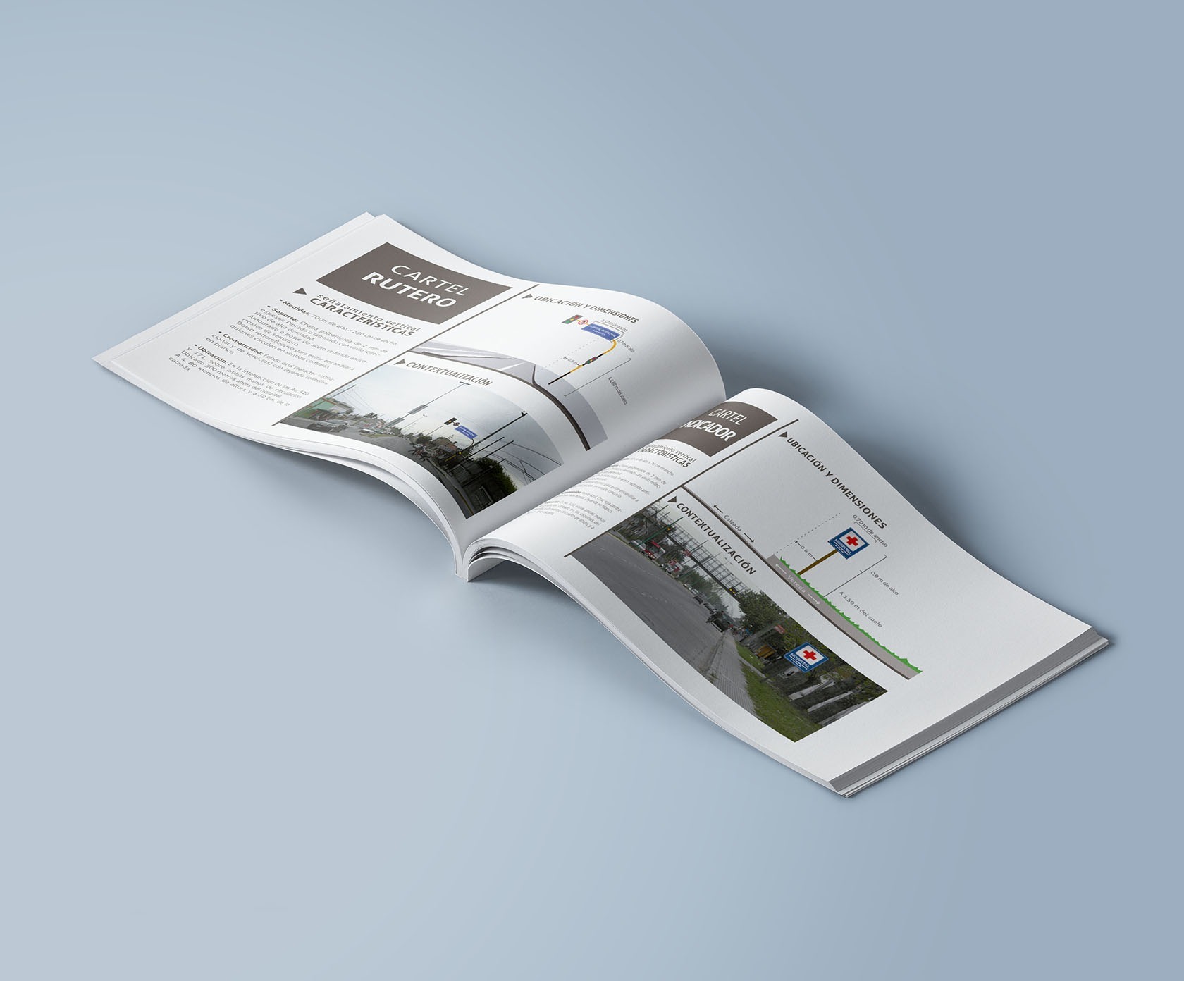
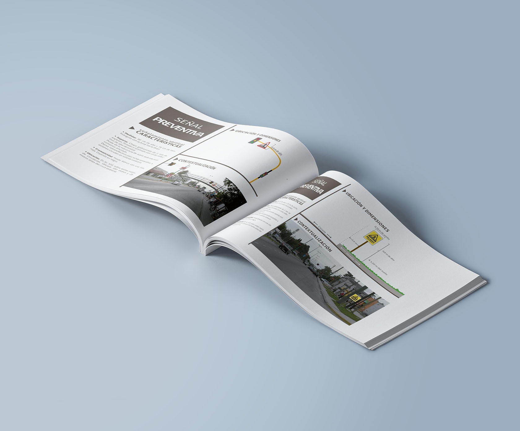
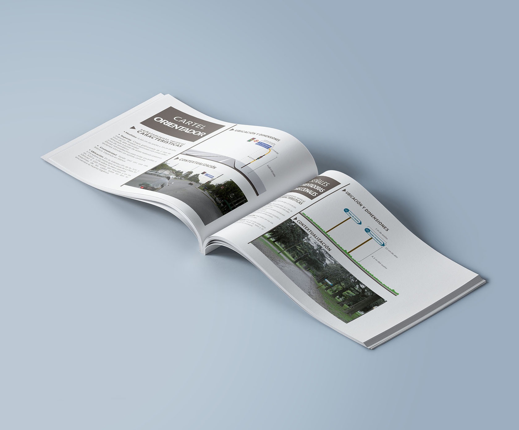
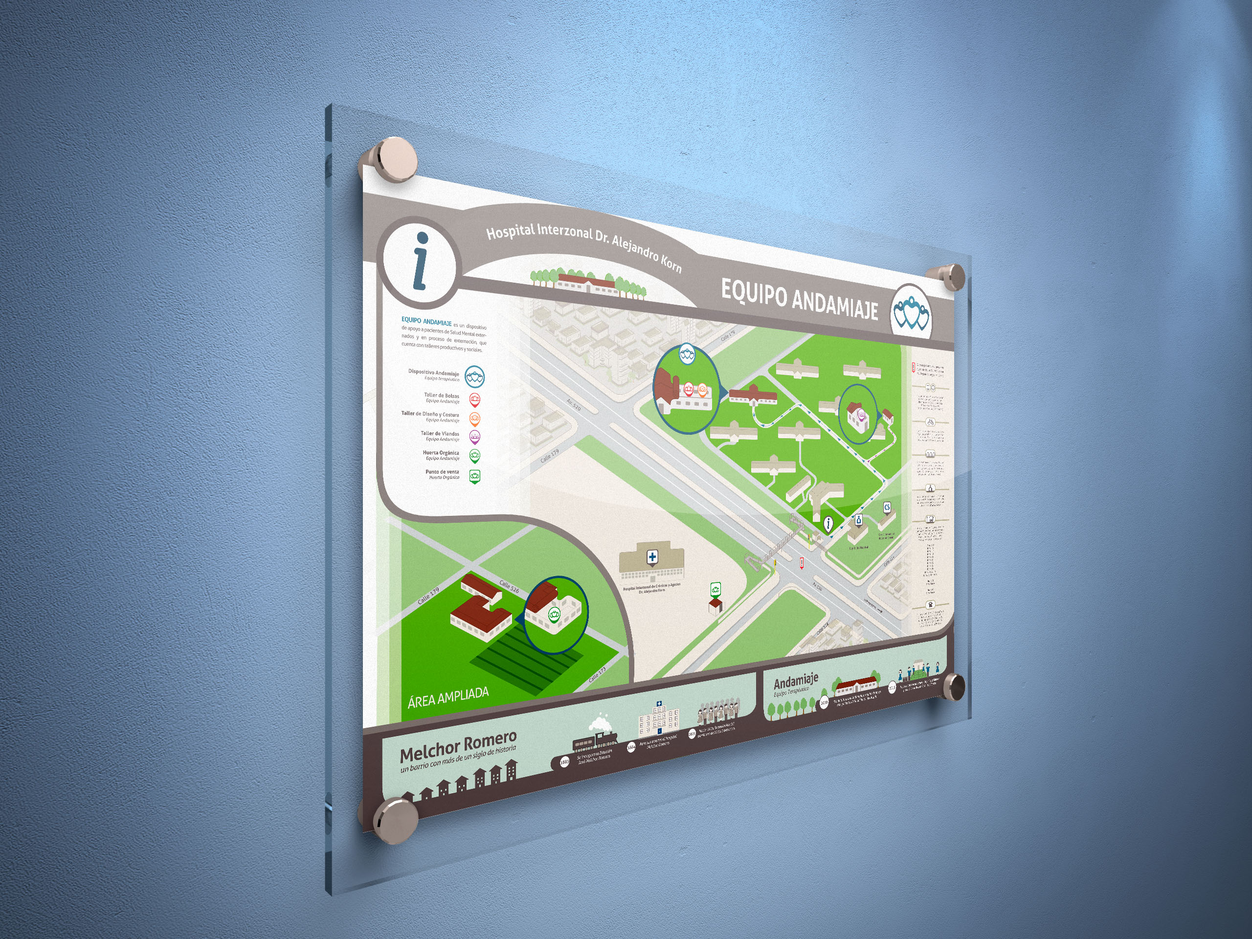
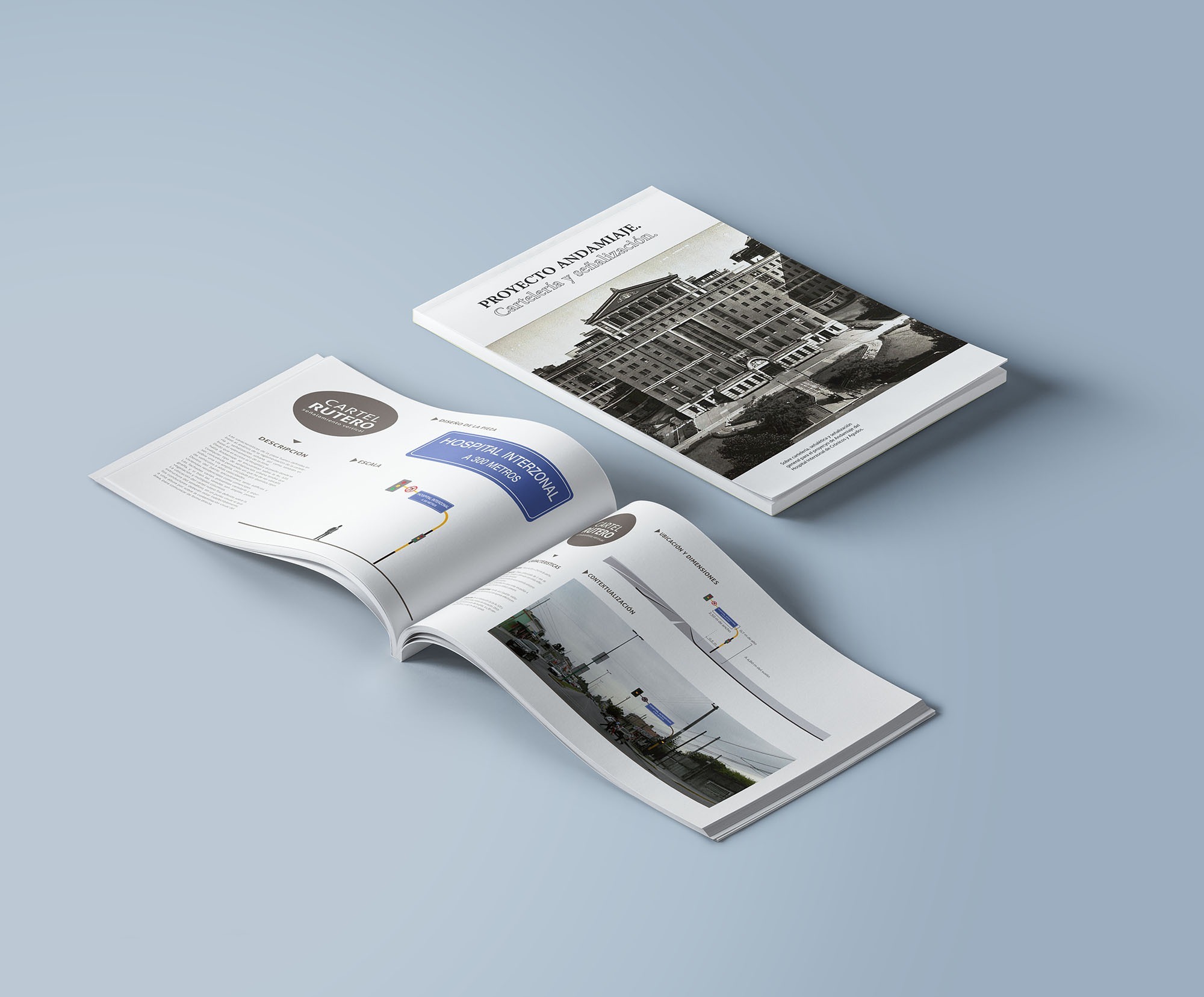
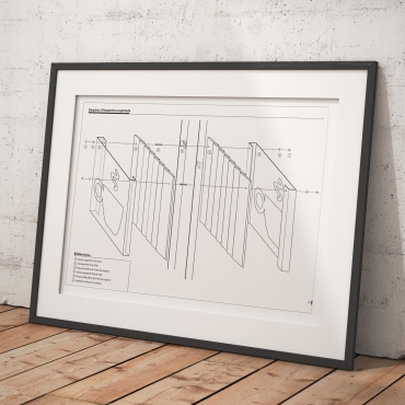
Since Andamiaje was part of a Public Hospital, the group also needed interior and exterior signalling, and even route signs, since they were located next to a main road. For this part of the project, I studied the general rules of street and route signs building and implementation, together with the retro-reflection of the paints and materials, and the finish used for surface protection. Once I had the proper information, I set the designs and also made a report explaining all the details of the signs implementation.
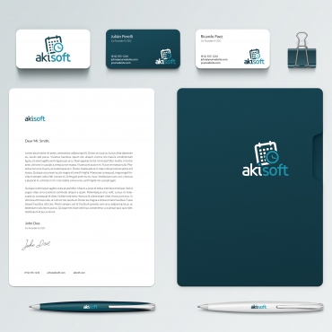
Afterwards, I designed different communication pieces (such as flyers, magazines, etc.) but also aprons, stands and other pieces that would help the group to establish a formal appearance.
